Your Amazon Listing Isn't Converting Because Your Images Are a Liability
If you have traffic but no sales, the answer to "why my Amazon listing isn’t converting" is almost always your images. Shoppers make snap judgments in under three seconds based entirely on what they see.
Your copy supports the sale, but your images make it.
Your Images Are Costing You Sales. Period.
You've done the hard work. You’ve driven traffic to your listing through PPC and organic rank, yet your unit session percentage is dismal. Before you start tweaking your price, overhauling your copy, or blaming your ad campaigns, you need to confront the most likely culprit: your product images.
This isn't a small problem. It's the primary reason well-funded products stall out on Amazon.
Your image stack is your digital salesperson, working 24/7. A weak hero image kills your click-through rate before a shopper even lands on your page, making every dollar of ad spend less efficient. Once they do click, generic or uninspired secondary images fail to answer their unspoken questions, build trust, or communicate why your product is worth their money. This sends motivated buyers straight to a competitor's page.
If you really want to understand the power of visuals, you need to grasp what it takes to get truly stunning product shots.

The Glaring Gap Between Traffic and Conversion
The data tells a clear story. While average Amazon conversion rates hover around 9-11%, that number can skyrocket to 15-25% for FBA products with optimized images that sell the product.
Conversely, listings with blurry hero shots or boring stock photos often crater. I've seen poorly optimized pages converting at a painful 3%, while top performers in the same category are hitting 30%. The difference is almost never the product itself. It's the visual pitch.
Your Amazon images are not a creative exercise. They are strategic assets designed to eliminate buyer friction, overcome objections, and justify your price point. Every single pixel must have a purpose.
Treating your images as a final checklist item instead of the core of your conversion strategy is a massive, costly mistake. They are the single most important lever you can pull to improve performance. For a deeper dive, our guide on the AZ Prod shots blog breaks down how to optimize every part of your listing.
Let's diagnose exactly what's wrong with your visuals.
Conversion Killers: A Quick Image Audit
Use this diagnostic table to spot common, high-impact issues tanking your sales. Be brutally honest in your assessment.
| Image Issue | Impact on Conversion | How to Fix It |
|---|---|---|
| Low-Resolution / Blurry Hero Image | Crushes Click-Through Rate (CTR). Shoppers assume low quality. | Re-shoot with proper lighting. Must be 1500px on the longest side and crystal clear. |
| No "In-Context" or Lifestyle Shots | Buyers can't picture using it. Increases hesitation. | Show the product in a realistic setting, being used by your target customer. |
| Text-Heavy, Unreadable Infographics | Information overload. Shoppers won't read paragraphs on an image. | Redesign with one key benefit per image. Use large, simple text and icons. |
| Generic, Unbranded Feel | Product looks like a cheap commodity. No perceived value. | Invest in custom photography. Avoid free stock photos or generic 3D renders. |
| Doesn't Show Scale or Size | Creates uncertainty and leads to returns. | Include a shot with a common object (like a hand) or add clear dimension callouts. |
| Fails to Address Negative Reviews | Missed opportunity to handle objections before they arise. | Read your 1-star reviews. Create an image that visually proves that issue isn't a problem. |
This isn't an exhaustive list, but fixing even one of these issues can have a dramatic, immediate impact on your unit session percentage. Now, let's break down how to fix these visual flaws killing your sales.
Deconstructing Your Hero Image
Your main image is the single most important piece of real estate on your entire listing. Full stop. It dictates your click-through rate (CTR) in search results and is the first signal of quality a shopper receives.
If your hero image is weak, you're losing the sale before a customer even lands on your page. The rest of your fancy copy and A+ Content won't get a chance.
The old advice to "use a white background" is now table stakes. To win, you must move beyond just following the rules. A great hero image doesn't just show the product; it stops the scroll. It communicates value and makes your product look undeniably better than the competitors sitting right next to it. A poorly lit, low-res, or badly framed photo screams "amateur seller," eroding trust in a split second.

Winning the Mobile Thumbnail War
Here’s a hard truth: over 70% of Amazon traffic is now on mobile. Yet, most sellers still approve their images on a giant desktop monitor. This is a fatal mistake.
An image that looks decent on a 27-inch screen often turns into an unrecognizable smudge on a 6-inch phone. On mobile, your hero is crushed into a tiny square. Intricate details vanish. Subtle shadows become mud. The only mission is instant recognition and perceived quality.
Your hero image must be designed and evaluated as a one-inch square first. If it doesn't pop and clearly communicate what the product is at that size, it has already failed. This mobile-first approach is non-negotiable.
Try it now. Pull up your listing and zoom out until the image is the size of a postage stamp. Can you still tell what it is? Does it look sharp? Or does it blend in? If it's not crystal clear, you are losing clicks every day to competitors who get this right. For serious sellers, a dedicated Amazon product photography service isn't a luxury; it's a competitive necessity.
Common Hero Image Conversion Killers
I see the same predictable mistakes sink listings all the time. These aren't small tweaks; they are foundational flaws that directly answer, "why isn't my Amazon listing converting?"
Let's run through the usual suspects:
- Ignoring Scale and Proportion: The product looks tiny or is cropped weirdly in the frame. This makes it look cheap. Your product must fill at least 85% of the image frame to have presence.
- Flat, Unflattering Lighting: Bad lighting gives your product a dull, low-value vibe. Professional lighting isn't about making it bright; it's about creating depth, highlighting textures, and making the product feel premium.
- Failing the "Squint Test": If you squint at the search results, does your product jump out, or does it dissolve into a sea of sameness? You need a distinct silhouette and strong contrast to grab attention fast.
- Including Distracting Props: While sometimes allowed in secondary images, cluttering the main image with props is a classic mistake. It confuses the buyer about what’s actually included in the sale. Simplicity and clarity win.
Fixing these hero image blunders is the highest-leverage action you can take. It directly boosts your CTR, which in turn boosts organic ranking and makes every dollar you pour into PPC go further.
How Secondary Images Close the Sale
If your hero image earns the click, your secondary images must earn the add-to-cart. This is where most sellers completely drop the ball.
They clutter their image slots with generic feature lists, uninspired lifestyle photos, or worse—they leave them empty. Your image stack is a sales funnel. Each of your six secondary slots is a tool for closing the deal.
Stop thinking of these as just more pictures of your product. Treat each image as a strategic asset designed to answer a specific question, handle an objection, or showcase a key benefit. This is how you systematically dismantle buyer purchase anxiety and guide them to the buy button.
The answer to "why isn't my Amazon listing converting?" is almost always hiding in a weak, unplanned secondary image strategy.
Building Your Image Stack from Customer Data
Your best ideas for secondary images aren't in your head. They're in your customer reviews and your competitors' listings. Before you design a single pixel, dig into the data to find what drives your buyers—and what makes them nervous.
Start by mining your own 1-star reviews and those of your top three competitors. What are the recurring complaints?
- "Smaller than I expected."
- "Doesn't work for [specific use case]."
- "Confusing to assemble."
These aren't just problems; they are a direct roadmap for your images. Your job is to create visuals that proactively prove these issues don't exist with your product. If they say it's small, your second image needs to be a scale shot showing its dimensions clearly. If assembly is a known pain point, your third image can be a simple three-step infographic.
Your secondary images are your preemptive strike against negative reviews and returns. Use them to visually counter every major objection and doubt a shopper might have before they even think to ask the question.
A Framework for Strategic Image Slots
Don't just upload six random photos and hope for the best. You must assign a specific job to each image slot. This creates a compelling visual story that moves the shopper toward a decision.
This disciplined approach ensures no pixel is wasted. Every key value proposition gets absorbed instantly, even by skimmers who will never read your bullet points. A solid framework forces you to address the entire buyer journey—from understanding the benefit to trusting the quality—all within the image block. It's how you turn a photo gallery into a high-performance conversion machine.
Here's a battle-tested structure that gets results.
Strategic Image Slot Planning Framework
| Image Slot | Strategic Purpose | Content Example |
|---|---|---|
| Image 2 | Benefit Showcase | An infographic showing the primary outcome. For a sleep mask, this is "Block Out 100% of Light for Deeper Sleep," not "Made of Silk." |
| Image 3 | Lifestyle/In-Use | A shot of your ideal customer genuinely using and benefiting from the product. This builds an emotional connection and helps shoppers see it in their own life. |
| Image 4 | Objection Handling/Scale | Directly address a common concern from reviews. Show scale with a hand or coin, or highlight a feature that solves a known problem. |
| Image 5 | Feature Callout | A close-up or exploded view highlighting a specific component that proves quality, like "Reinforced Stitching" or "BPA-Free Silicone." |
| Image 6 | Comparison Chart | A simple "Us vs. Them" chart showing how your product is superior to generic alternatives. Focus on 2-3 key differentiators. |
| Image 7 | Social Proof/Brand Story | Display your warranty, satisfaction guarantee, or a simple brand mission statement. This final image builds trust and reduces perceived risk. |
This isn't a rigid rulebook, but a starting point. The real power comes from adapting this framework to the specific questions and objections your customers have. Get that right, and your images start selling for you.
Plugging the Hidden Leaks in Your Listing
Even the best photos in your category can't do the job alone. Sellers get fixated on images—which is the right place to start—but miss other leaks sinking their conversion rate.
Subtle disconnects between what your images show and what the rest of your listing says create friction. They plant seeds of doubt. And doubt kills sales.
If you’ve already overhauled your photos and you're still asking, "Why isn't my Amazon listing converting?", the culprit is almost always a mismatch in your messaging, pricing, or social proof. These pieces must work together to tell one cohesive story. When they do, clicking "Add to Cart" feels like a no-brainer.
Mismatched Messaging Kills Trust
The fastest way to lose a customer is to confuse them.
When your images promise one thing, but your title and bullet points scream something else, you force the shopper to slam on the brakes. That's a fatal mistake.
For example, your lifestyle photo shows a rugged, durable water bottle on a mountain trail. But your title is packed with keywords like "lightweight for office use." That clash creates an instant credibility gap. The shopper has no idea what your product is actually for, loses trust, and clicks away. Your copy must hammer home the exact same story your images are telling.
Every single part of your listing—from the hero image to the last bullet in your A+ Content—has to tell the same simple story. A confused shopper never, ever buys.
When Your Price and Your Pictures Don't Align
Long before a shopper glances at the price, your images have already set a value expectation. Professional, slick photography screams "premium quality" and justifies a higher price tag. Amateur, poorly lit photos make a product feel cheap.
This is where many sellers shoot themselves in the foot. They’ll use mediocre images for a $50 product and wonder why no one’s buying. The problem is, their visuals have already anchored the product's value at $20 in the shopper's mind. When they see the actual price, it feels like a rip-off.
Your images must visually earn your price tag. If you want to charge a premium, you absolutely must invest in visuals that look the part.
Don't Let Your Images Contradict Your Reviews
Your customer reviews are pure gold, but your images can either make them shine or make them look like fakes.
Let's say your top reviews rave about your product's "sturdy metal construction." But your main images look like cheap, plastic-y 3D renders. You've just created a massive conflict.
Shoppers trust what other buyers say, but they believe what they see with their own eyes first. That contradiction raises a huge red flag and makes them question if your reviews are real. The fix is simple: use your images to prove your social proof is true. If customers love a specific feature, dedicate an entire image to showing off that exact feature in crystal-clear detail. This builds a powerful, unified case for your product that competitors can't touch.
An Actionable Framework for Fixing Your Images
Knowing your images are the problem is one thing. Knowing which image to fix first—and how to prove your changes worked—is what separates stagnant sellers from the top 1%.
Guesswork is expensive. It costs you time and bleeds sales. This framework kills guesswork by using your own data to find the weakest link in your visual sales funnel.
The goal is simple: stop making changes based on gut feelings and start making decisions based on data. You already have all the info you need in your Seller Central Business Reports. It's time to use it.
Pinpointing the Leak: Clicks vs. Conversions
Your listing’s performance boils down to two key metrics. Each points directly to a different part of your image stack. You just have to figure out where shoppers are dropping off.
Low Click-Through Rate (CTR): High impressions but barely any clicks? Your hero image is the problem. It’s failing to grab attention in a sea of search results. It isn't compelling enough to earn the click over your competitors. Nothing else matters until this is fixed.
Low Conversion Rate (CVR): Getting plenty of clicks but your Unit Session Percentage is in the gutter? Your secondary images are failing. The hero got them to the page, but the rest of your visuals didn't build trust, answer their questions, or convince them to hit "Add to Cart."
This simple check tells you exactly where to focus your energy first. Don't waste a second redesigning your infographics (a CVR problem) if your hero image can't even get shoppers to your page (a CTR problem).
Validating Your Fixes with Data
Once you’ve identified the main leak, you must test your solution methodically. For the hero image, this is where Amazon’s “Manage Your Experiments” tool is invaluable.
This tool lets you run a true A/B split test on your main image. Amazon serves different versions to shoppers and tells you which one performs better. Run any test for at least two weeks to get clean data. The goal isn't just to find a "better" image; it's to find one that definitively improves your CTR.
For secondary images, testing is less direct but still critical.
- Dig into your 1-star reviews and find the biggest objection (e.g., "product is way smaller than I thought").
- Create a new infographic or lifestyle photo that directly and visually crushes that specific objection.
- Swap this new image into your second or third image slot.
- Watch your Unit Session Percentage like a hawk for the next 14-30 days.
If your conversion rate ticks up, you've proven that your new image is successfully knocking down a key purchase barrier. When you're ready to get visuals designed to systematically handle these objections from the start, consider a research-backed Amazon image service.
This whole process is about finding and plugging the leaks where you lose customers. Most of the time, it's due to a mismatch in expectation, price friction, or a lack of trust.
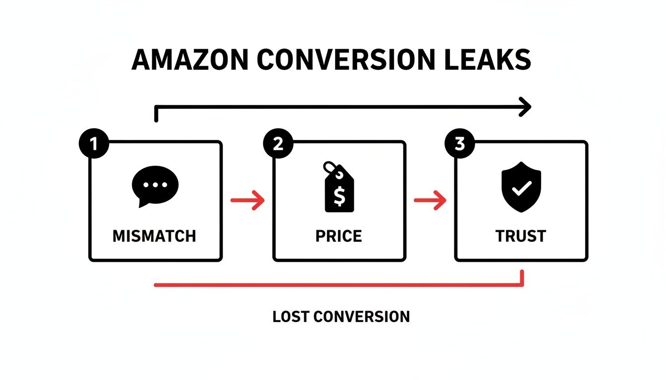
The key takeaway is that conversion leaks are rarely one catastrophic failure. They're a series of small frictions that add up until the shopper just gives up and leaves.
Think of Your Images as a Profit Multiplier, Not a Cost
Fixing your images isn't just about getting a quick bump in your conversion rate. It’s a move that sends positive ripples through your entire Amazon business, making everything more efficient and profitable.
Too many sellers see images as another box to check, a line item in their launch budget. That’s a mistake. Your images are the central engine of your listing’s performance. When you’re trying to figure out why a listing isn’t converting, your visuals are almost always the most powerful lever you can pull.
A better image stack doesn’t just sell the product better on the page; it fundamentally changes the math on your advertising and ranking efforts.
How Better Images Lower Your Ad Spend and Boost Your Rank
A strategically sound set of images directly makes your PPC campaigns work better. It’s that simple.
A killer hero image gets more people to click, boosting your click-through rate (CTR). Amazon sees that higher CTR, recognizes your ad as more relevant, and often rewards you with a lower cost-per-click (CPC). Once they land on the page, better secondary images seal the deal, which increases your unit session percentage—the clearest signal you can send the algorithm that your traffic is converting.
This higher conversion rate (CVR) is gold for Amazon's A9 algorithm. It proves your listing is satisfying customer searches, which leads to better organic ranking over time.
This kicks off a powerful flywheel effect:
- A higher CTR from your hero image makes your ads cheaper and more effective.
- A higher CVR from your secondary images makes your ads more profitable (and lowers your ACoS).
- That improved CVR tells Amazon to rank you higher for your keywords.
- Better organic rank means you can rely less on expensive paid traffic.
Investing in a research-driven, professionally executed set of images is the single highest-leverage thing you can do for your listing. It stops the bleeding from low conversions and makes every dollar you spend on ads and every organic visitor a more profitable asset.
Ultimately, professional, benefit-focused images build a real brand. They justify a higher price, increase the perceived value of your product, and create a competitive moat that sellers using generic, off-the-shelf visuals just can’t cross.
Frequently Asked Questions About Amazon Conversion
What Is a Good Conversion Rate on Amazon?
This depends on your category, but for most FBA sellers, a solid benchmark is 10% or higher.
Truly dialed-in listings—the ones with killer images and rock-solid social proof—can push into the 15-25% range. If you're seeing numbers under 8%, that’s a red flag. It’s a strong signal that your visuals or copy aren't connecting with shoppers and failing to close the deal.
How Do I Know if My Images Are the Problem?
Let the data tell the story. Your ad reports are a goldmine.
Are you getting a low click-through rate (CTR)? That almost always points to a weak hero image. It’s not grabbing attention on a crowded search results page.
On the other hand, if you're getting plenty of clicks but your unit session percentage is in the gutter, your secondary images are the likely culprit. People are interested enough to click, but what they see next isn't convincing them to add to cart.
How Much Should I Invest in Product Photography?
Stop thinking of it as a cost. It’s an investment. The right set of images acts as your best, most relentless salesperson, working 24/7.
It's the core of what we do, and you can get a better sense of our philosophy by learning about our team. For a wider view on boosting your numbers, check out these 9 proven tactics to improve Amazon sales.