What Is Amazon Listing Optimization? A Conversion-Focused Approach for Sellers
For operators who've been in the trenches, what is Amazon listing optimization isn't about checking off boxes—it's about relentlessly engineering conversions. It’s the craft of strategically aligning every single piece of your product page, starting with the images, with how a real person thinks and buys. The goal is simple: systematically tear down any hesitation and drive the sale.
The Real Definition of Amazon Listing Optimization
Forget the textbook definition. True Amazon listing optimization is a conversion system, not just an SEO task. It’s the process of refining your title, images, bullets, and A+ Content to nail three things: visibility, click-through rate (CTR), and conversion rate (CVR).
The one non-negotiable rule is this: images sell the product first, your copy sells it second.
This is a strategic imperative. Your listing is your best 24/7 salesperson, but in a mobile-first world, that salesperson must communicate visually. Most shoppers will make a buy/no-buy decision based on your images alone, often without reading a single bullet point.
Moving Beyond Keywords to Conversion Engineering
Keywords get you found, but they don't get you paid. A modern optimization strategy focuses on what happens after the click. It’s about creating a dead-simple visual path from discovery to "Add to Cart."
This means your images have to work harder. They must:
- Stop the Scroll: Your main image has to be a pattern-interrupt in a sea of look-alikes on the search results page.
- Answer Questions Visually: Your secondary images must preemptively answer the top 3-5 questions a buyer has.
- Dismantle Objections: Use infographics and lifestyle shots to crush common doubts and build instant trust.
- Justify the Price: High-quality visuals are the fastest way to signal a premium product, making your price feel like an investment, not an expense.
A truly optimized listing anticipates what customers are worried about, highlights why your product is the only logical solution, and closes the deal visually. It turns a static product page into a high-performance conversion machine, and it starts with the images.
This visual-first strategy is a force multiplier. Better images improve your PPC efficiency by boosting click-through and conversion. They improve organic ranking because Amazon rewards listings that convert. To dig deeper into the mechanics, check out this performance-driven guide to Amazon listing optimization.
Ultimately, every change must be a calculated move to improve real metrics. When you nail your visual strategy, you make every other part of your business—from paid ads to organic traffic—more profitable. For more on these strategies, you can find a ton of resources over on our blog.
Using Images As Your Primary Conversion Lever
Let's be blunt: your product images are not decoration. They are your single most powerful sales tool on Amazon, period.
While other sellers get lost in keyword density spreadsheets, savvy operators know that visuals drive the purchase decision. The copy supports the sale, but the images make the sale. A customer’s choice to click, investigate, and ultimately buy happens almost entirely based on what they see in the first few seconds.
This is why a lazy, “check-the-box” approach to product photography is a guaranteed way to bleed cash. Just having "high-quality photos" is table stakes. Real optimization demands a strategic, research-backed plan where every single image slot has a specific job. Each photo must be engineered to do one of three things: stop the scroll, answer a question, or crush a buying objection.
In a marketplace this crowded, a visual-first strategy is non-negotiable. Images are proven conversion machines, capable of slashing buyer hesitation and boosting your sales velocity. Your visuals are the primary differentiator between your product and a dozen nearly identical competitors.
Building Your Visual Sales Funnel
Treat your image block like a mini-landing page. It must guide the shopper from initial curiosity to a confident purchase, often before they even glance at your bullet points. The flow is simple but critical: move from broad appeal to specific proof.
This diagram nails the fundamental flow of Amazon optimization. Notice what comes first.
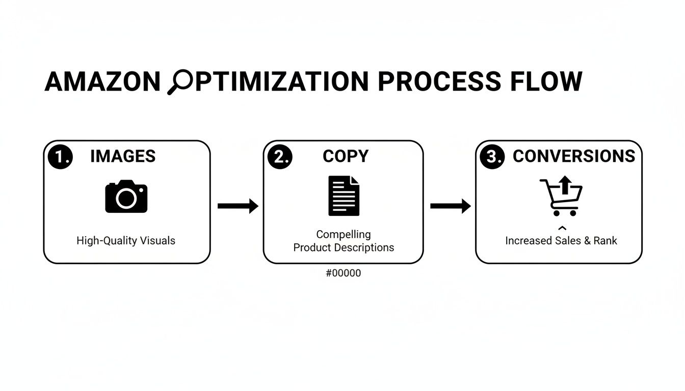
The takeaway is clear. A weak visual strategy torpedoes everything else, no matter how great your product or PPC targeting is.
Deconstructing Each Image Slot for Maximum Impact
Every one of your seven to nine image slots needs to serve a distinct purpose. Wasting a slot on a redundant angle or a generic stock photo is like leaving money on the table.
Here’s a battle-tested structure that wins:
- Image 1 (The Scroll Stopper): Your main image has one job: get the click from the search page. It must be clean, perfectly compliant with Amazon's rules (pure white background!), and instantly communicate what your product is. A common mistake? A dim or off-white background that blends in and gets ignored.
- Images 2-3 (Benefit-Driven Infographics): These are not feature lists. They are visual arguments that show you solve a real problem. Dig into competitor reviews to find the top two or three benefits customers are screaming for, then design clean infographics that showcase those results. The biggest mistake here is cramming in tiny text that's unreadable on mobile.
- Images 4-5 (Lifestyle and In-Use Context): Show your product in the real world, in the hands of your ideal customer avatar, solving the exact problem it was made for. This builds an instant emotional connection. Don't use cheesy, generic stock photos that scream "fake" and kill trust.
- Image 6 (Social Proof and Comparison): This slot is perfect for showing off a killer testimonial (pulled from a review), a comparison chart against the competition, or a unique feature that sets you apart. This is where you visually answer the "Why you?" question.
- Image 7 (The Value Proposition): Your last image should wrap it all up. This could be an infographic showing everything included in the box or a graphic that reinforces your brand promise or guarantee. Leave them with zero doubt.
Your image stack isn't a gallery; it's a closing argument. If a shopper can understand your product's core benefits, see it solving their problem, and have their main objections answered just by swiping through your images, you've won.
This research-first approach ensures every visual is pulling its weight. For sellers who want this done right without the guesswork, services that provide research-driven Amazon listing images are built to execute this exact strategy.
Optimizing Copy For Humans And The Algorithm
Your product images do the heavy lifting, but your copy is the critical support crew. It must back up the visual story your images are telling, not just list features.
Think of your copy as the final handshake. It’s there to close any remaining gaps, build trust, and give both shoppers and Amazon’s algorithm exactly what they need to see your product as the only logical choice.
Writing for Amazon is a tightrope walk. You need a title that stops a human scroller dead in their tracks while simultaneously feeding the algorithm the keywords it craves. Your bullet points have to amplify the benefits you’ve already shown in your images, turning a cool picture into a must-have solution.
This isn’t about keyword stuffing. That strategy is dead. This is about creating a cohesive sales message where every word justifies the click your main image just earned.
Writing Titles That Hook And Rank
Your title is your first—and sometimes only—shot at blending a strong sales pitch with algorithmic relevance. Many sellers get this wrong, creating robotic strings of keywords that repel human shoppers. On the flip side, a purely creative title with no core keywords is invisible to Amazon's search.
The key is to front-load the most critical info. Start with your brand and what the product is, then weave in your top 1-2 keywords. Finish with a key benefit or use case that nails a major customer pain point.
- Bad Title: "Yoga Mat Non Slip TPE Eco Friendly 6mm Thick High Density Exercise Mat for Pilates Fitness"
- Optimized Title: "BrandName | ProGrip Yoga Mat for Sweaty Hands | 6mm High-Density TPE for Joint Support, Non-Slip for Hot Yoga & Pilates"
The second title speaks directly to a problem ("sweaty hands"), communicates a clear benefit ("joint support"), and still packs in the necessary keywords. It's written for a person, not just a machine.
Bullet Points That Amplify Your Visuals
Your bullet points should never be a boring list of features. Their real job is to add context and emotional punch to the benefits you've already shown in your images. Each bullet should act like a mini-headline, grabbing attention and expanding on a key value proposition.
Think of your images as the "what" and your bullet points as the "so what." The image shows the non-slip texture; the bullet point explains that this means "you can finally hold downward dog without sliding, even in a hot yoga class."
Start each bullet with a capitalized, benefit-focused phrase to make them scannable on mobile. Then, use the rest of the sentence to elaborate, weaving in long-tail keywords where they feel natural.
A Simple Framework for Killer Bullet Points:
- Mine Your Reviews: Dig through your own reviews and your top three competitors'. Find the exact words customers use to describe their problems and what they love about the solution. This is your source of truth.
- Map Bullets to Images: Assign each bullet point to a specific image. If image #2 is an infographic showing the mat’s thickness, your second bullet point should be all about joint protection and comfort.
- Lead with the Benefit: Don't start with "6mm TPE Material." Start with "ULTIMATE JOINT SUPPORT: Our 6mm high-density TPE cushions your knees and wrists..."
This approach forces your images and copy to work as a team, building a powerful, unified argument that pushes shoppers toward "Add to Cart."
This strategic shift from old-school keyword stuffing to a modern, conversion-focused approach is critical.
Evolving From Outdated To Conversion-Focused Copy
| Listing Element | Outdated Keyword-Focused Approach | Modern Conversion-Focused Approach |
|---|---|---|
| Title | A long, robotic string of keywords with no clear benefit. | A clean, benefit-driven headline that includes primary keywords naturally. |
| Bullet Points | A dry list of features and technical specs. | Mini-headlines that expand on visual benefits, using voice-of-customer language. |
| Description | A dense paragraph of text stuffed with every possible keyword variation. | A scannable, engaging story that overcomes objections and builds trust. |
| Overall Goal | Rank for as many keywords as possible, regardless of readability. | Guide the shopper on a journey from interest to purchase, using copy to support visuals. |
This evolution is a direct response to how Amazon's algorithm and customer behavior have matured.
Adapting To The New SEO: The COSMO Model
The days of just matching keywords from a search term report are over. Amazon's A9 algorithm has evolved into a smarter, semantic search engine known as COSMO. This model cares more about the intent behind a search, not just the specific words.
This shift means keyword mastery defines Amazon listing optimization success, where relevance reigns supreme. Sellers still using 2023 tactics get sidelined as AI like Rufus ignores mismatched listings. You can discover more insights about how Rufus is changing Amazon SEO and what it means for your strategy.
Your copy must now use natural language, synonyms, and contextually related phrases to prove you understand the customer's world, not just their search terms.
Pricing and Reviews: The Two Levers Most Sellers Get Wrong
So you’ve polished your title and bullet points. Your images look sharp. But if you ignore pricing and reviews, all that hard work can fall flat.
These two elements are the ultimate deciders for shoppers. They signal value and build trust—or destroy it in seconds. Get them right, and you create a powerful conversion engine. Get them wrong, and even a perfect listing won't sell.
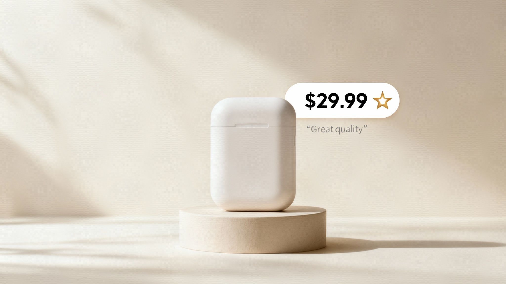
Your Price Is a Story—Your Images Tell It
Your price isn’t just a number; it’s a direct message to your customer about quality.
Go too low, and you scream "cheap." Go too high without justification, and you're just overpriced. This is where your images must do the heavy lifting, justifying every penny.
Using Images to Justify a Higher Price
Want to command a higher price? Your images need to make that price feel like a bargain. High-quality visuals are the fastest way to communicate premium value and make a higher price point feel completely reasonable.
Here’s how you build a visual case for your price:
- Show Off Premium Materials: Use close-up macro shots to highlight the texture, stitching, or finish that cheaper alternatives lack. Make the quality tangible.
- Detail Better Construction: Don't just say it's durable. Create an infographic that points to the reinforced seams or the scratch-resistant coating. Prove it visually.
- Demonstrate a Superior Experience: Your lifestyle shots need to show more than just the product in use. They need to show a better outcome—one that only your product delivers.
When your visuals scream "premium," your price tag doesn't feel like a barrier. It feels like a confirmation of quality. So many sellers miss this; they price high but use lazy, generic images, creating a disconnect that kills the sale.
Reviews Aren't a Grade—They're a Roadmap
Your customer reviews are raw, unfiltered market intelligence. They are not just social proof; they are a direct feed telling you exactly what’s working and what isn’t.
Stop thinking of reviews as a final report card. Start treating them like your most valuable consulting team. They show you exactly where your images and copy are failing to connect.
This is what turns listing optimization from a one-time task into a continuous feedback loop. You’re no longer guessing what buyers care about. They’re telling you every single day.
How to Mine Reviews for Image Ideas
Systematically read your reviews—and the reviews of your top three competitors. Your goal is to spot the patterns in what people ask, what they complain about, and what they love.
This is how you turn raw data into a smarter visual strategy:
- Find Recurring Questions: If shoppers keep asking, "Is it waterproof?" or "How big is it, really?"—that’s a huge red flag. Your images are failing. Add an infographic with clear dimensions or a lifestyle shot of the product in the rain. Answer the question visually before they have to ask.
- Spot Negative Feedback Patterns: Are people complaining the "color is different in person" or it was "way smaller than I expected"? You have an image problem. Fix it with color-accurate photos and scale-comparison shots to manage expectations.
- Amplify Positive Feedback: When customers rave about a specific feature you barely mentioned, that's your signal. Make that feature the star of a new infographic or lifestyle photo. Double down on what they already love.
By creating this feedback loop, your listing becomes a living asset that constantly adapts to what customers actually want. Your images stop being decorative and start dismantling objections and highlighting real benefits.
How To Measure The Success Of Your Optimization
Optimization without measurement is just guesswork.
Throwing a new image on your listing and hoping for the best is a losing strategy. To turn your efforts into a repeatable system, you have to track the right data. Forget vanity metrics like impressions; we're focused on the key performance indicators (KPIs) that translate directly to sales and profit.

This isn't about getting lost in spreadsheets. It's about seeing the direct line between the changes you make and the results you see in your Business Reports. When you know which levers to pull and how to measure their impact, optimization stops being a gamble and becomes a data-driven strategy.
The Only Metrics That Matter
Three core metrics will tell you everything you need to know about how your listing is performing. They are the most direct indicators of how shoppers are interacting with your page.
Click-Through Rate (CTR): The percentage of people who see your product in the search results and actually click on it. This is the primary test of your main image and title. A low CTR means you're invisible.
Unit Session Percentage (CVR): The conversion rate. This is the holy grail. It’s the percentage of visits that result in a sale. Your secondary images, bullet points, and A+ Content do the heavy lifting here.
Add-to-Cart Rate: A powerful leading indicator of purchase intent. A shopper adding your product to their cart is a huge signal that your images and copy have successfully answered their questions and handled their objections.
These metrics are all connected. A killer main image boosts your CTR, bringing more traffic. Then, your strategic secondary images take that traffic and improve your CVR, turning clicks into cash.
To put it simply, here’s a breakdown of the essential metrics and the listing elements that drive them.
Key Metrics For Measuring Optimization Impact
| Metric | What It Measures | Primary Listing Driver |
|---|---|---|
| CTR | % of shoppers who see your product and click | Main Image, Title, Price, Reviews |
| CVR | % of visitors who buy your product | Secondary Images, Bullets, A+ Content |
| Add-to-Cart | % of visitors who add the product to their cart | Images, Bullets, A+ Content, Price |
Understanding this relationship is key. You can't fix a conversion problem by only changing your title, just like you can't fix a click-through problem by only changing your A+ Content.
A Practical Framework For Tracking Performance
To measure success accurately, you need a clean "before and after" snapshot. Randomly changing five things at once will muddy your data and leave you clueless about what actually worked.
Instead, follow a disciplined approach:
- Establish a Baseline: Before you touch anything, pull a report for the last 30 days. Document your average CTR, CVR, and total sessions. This is your benchmark.
- Isolate Your Variable: Change only one major element at a time. If you're testing a new main image, don't also rewrite your title. Let the new image run for at least two weeks to gather enough data.
- Analyze the Results: After the test period, pull a new report. Compare it to your baseline. Did CTR go up? Did CVR stay the same? This tells you if your change had the intended effect.
- Iterate and Repeat: If the new main image boosted CTR, lock it in. Now, you can move on to the next variable, like a new set of infographics, and repeat the process to improve your CVR.
Your Amazon Business Reports aren't just for accounting; they are your primary optimization tool. Use the 'Detail Page Sales and Traffic by ASIN' report to find the data you need to make informed, profitable decisions.
This methodical process removes emotion and ego from the equation. It forces you to rely on data, ensuring every change is a proven step forward. This is the core of effective what is amazon listing optimization—a constant cycle of testing, measuring, and refining based on what real customers actually do.
Stop Guessing And Start Strategizing
Randomly tweaking your listing is a surefire way to burn time and money. Real Amazon optimization isn't about guessing. It's a calculated, research-backed process that starts and ends with your images.
If you take away just one thing, let it be this: your images are the single most powerful tool you have.
They’re the main lever you can pull to influence every metric you care about. A smart set of images directly boosts your PPC return by pre-selling the click. It bumps up your organic rank because a higher conversion rate tells Amazon your product is a winner. It even lets you charge more by visually proving your product's quality.
Your Listing Is Your Best Salesperson
It’s time to stop thinking of your listing as a static, digital product sheet. It's your top salesperson, grinding 24/7. But like any salesperson, it needs the right tools to close the deal.
The visuals have to be built to persuade, handle objections, and get the customer to click "Add to Cart." Every image slot is a chance to answer a question. When you operate this way, you move from guesswork to strategy. You stop playing defense and start leading the market with a listing that speaks directly to what your customers actually want.
The biggest mistake sellers make is treating their listing as a cost instead of an investment. They’ll pour thousands into inventory and ads, then get cheap on the one asset that actually turns traffic into profit—their images.
The message is simple. If you want to win on Amazon today, you must invest in strategic, research-driven images. It is the highest-leverage move you can make.
For sellers ready to give their top salesperson the tools it needs to dominate, getting professional, conversion-focused images is the fastest path to real growth. If you’re ready to stop guessing, it’s time to get your research-driven Amazon images and finally start strategizing.
Burning Questions About Listing Optimization
Even seasoned operators have questions when it comes to extracting every last drop of performance from a listing. Here are a few of the most common ones.
How Often Should I Refresh My Listing Images?
There's no magic number. Your images shouldn't be a "set it and forget it" asset; they're a living part of your strategy.
Test new visuals whenever you hit one of these triggers:
- Quarterly Check-ins: At a minimum, review your images every three months. Do they still look better than the competition?
- Performance Dips: If you see your CVR or CTR suddenly tank, your images should be the very first thing you investigate.
- A New Challenger Appears: When a sharp new competitor shows up with killer visuals, it’s a signal to re-evaluate your own. Don't get visually outgunned.
- Bad Review Patterns: Seeing the same complaints over and over? Things like "it's smaller than I thought" or "the color wasn't what I expected." That's direct feedback that your images are creating the wrong expectations. Fix them, fast.
Do Backend Keywords Actually Matter for Images?
Yes, but indirectly. Think of it like this: your backend keywords are what get your product invited to the party (the search results page). Your main image is what convinces the shopper to actually come inside (click on your listing).
While your search terms don't change how your images look, they are absolutely critical for getting your listing in front of the right eyeballs. Without well-optimized keywords, your perfectly crafted, high-converting images will never get a chance to do their job.
Can Better Images Really Let Me Charge a Higher Price?
Absolutely. Price is just a number until you attach a perceived value to it, and your images are your number one tool for doing that.
Imagine seeing a product with a $50 price tag, but the photos are dark and blurry. It creates a disconnect. The shopper immediately thinks, "This looks cheap. Why is it so expensive?" Trust is gone.
Now, picture that same $50 price on a listing with crisp, professional images that highlight premium materials and smart design. Suddenly, $50 feels like a deal. High-quality visuals build that crucial perceived value, giving you the pricing power that competitors with lazy images just don't have.
If you have questions about creating images that communicate value, contact our team of experts for straight answers.
Ready to transform your listing from a static page into your best salesperson? ProductShots creates research-driven, conversion-focused images that stop the scroll and turn clicks into customers.