Your Amazon Images Are The Listing. Stop Treating Them Like An Afterthought.
Here’s the deal: if you want to optimize your Amazon listing, you have to start with the single most important truth. Your images are your listing. They aren't just a part of it.
Before a customer ever bothers to read your perfectly crafted title or bullet points, they’ve already judged your product based on its pictures. Great images stop the scroll. Weak images kill sales, even for great products with huge ad budgets. This isn’t about making things “look nice”—it’s about engineering a visual sales argument that outperforms your competition.
Your Images Are The Listing, Not Just A Part Of It
Too many sellers treat their images like a chore—something to check off the list after the keyword research and copywriting are done. That’s completely backward, and it costs a fortune in lost sales and wasted ad spend.
The reality is that your images are your number one sales tool. They have to do the heavy lifting. They communicate value, build trust, and crush objections faster than any wall of text ever could. Your title and keywords might get you the click, but your images are what close the deal. Weak images force your copy and your PPC budget to work overtime to compensate, and they usually fail.
This isn’t just a theory; it’s how modern e-commerce works, especially on a hyper-competitive platform like Amazon. Shoppers are wired to make snap decisions, scanning for visual cues that scream, "This is the one." A powerful hero image can single-handedly boost your click-through rate (CTR) from the search results, which is a massive signal to Amazon that your product is relevant.
The Psychology of Visual Selling
Humans process images 60,000 times faster than text. It's a biological shortcut. This means your image stack is the most direct and powerful way to get inside a buyer's head.
A well-shot lifestyle photo creates an immediate emotional connection, letting the customer see themselves using and benefiting from your product. A clean, sharp infographic can break down complicated features into simple benefits, answering questions before the shopper even thinks to ask them. This is especially critical for mobile shoppers who refuse to read lengthy descriptions.
Your entire image gallery needs to work like a silent salesperson. It should walk the customer through a compelling story, moving them from initial curiosity all the way to clicking "Add to Cart." Every single image slot must have a specific, strategic job.
This isn't just about looking good; it has a direct impact on Amazon’s A10 algorithm, which is obsessed with conversion rate. A higher conversion rate, driven by strong visuals, improves your organic ranking.
One seller with a yoga mat listing completely overhauled their visuals. They went from a few basic product shots to nine strategic images—including lifestyle photos and infographics that directly addressed common pain points dug up from competitor reviews. The result? A 156% jump in their conversion rate. Their listing shot up from page three to page one for their main keywords in under 60 days. The only thing they changed was the images.
Images As A Force Multiplier
Strong visuals do more than just improve your conversion rate—they act as a force multiplier for your entire business.
They make your PPC campaigns more efficient by boosting click-throughs and dropping your ACoS. They increase the perceived value of your product, which gives you more wiggle room on pricing. And they build a real brand by making you look professional and trustworthy.
This principle isn't unique to Amazon. For a deeper dive, check out guides on how to create high-converting app store images; they highlight the same core idea that visuals are the first—and often only—thing people truly notice.
By shifting to an image-first mindset, you’re not just tweaking a listing. You’re building a more resilient and profitable business on Amazon. If you're ready to get started, you can explore specialized services that build research-driven Amazon listing images from the ground up at https://azprodshots.com/.
Deconstructing A High-Conversion Image Stack
Think your Amazon images are a gallery? Wrong. They’re a visual sales funnel. Each of the seven-plus slots has a specific, non-negotiable job. Treating them as just "product photos" is a rookie mistake that tanks conversions. You’re forcing customers to read your copy to figure out what you sell—a step most will just skip.
A high-performing image stack is an engineered narrative. It anticipates and dismantles buyer objections, builds an emotional connection, and justifies your price point long before they read a single bullet point. It’s about making every pixel work for you, guiding the shopper from curiosity to a confident "Add to Cart."
The visual hierarchy on your listing is everything. This flowchart shows how your images are the first thing a shopper interacts with, determining whether they even bother with your title or copy.
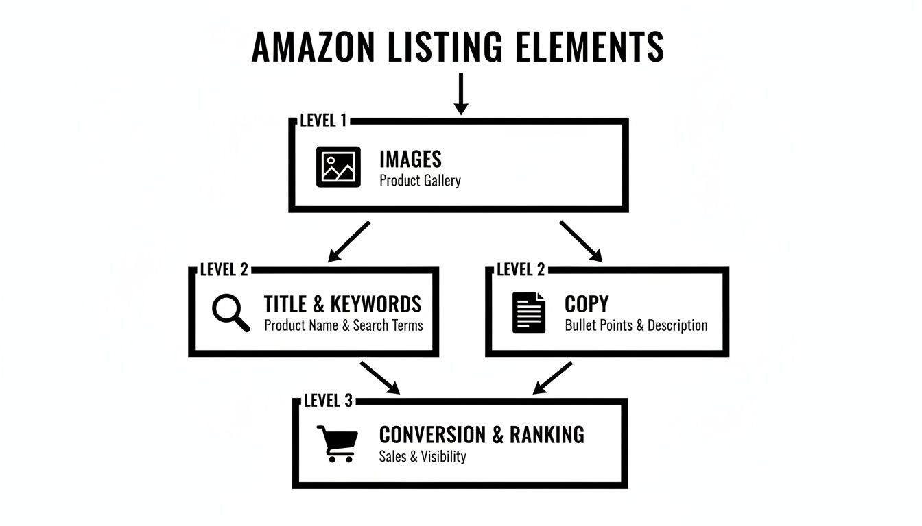
If your images fail to grab attention and scream value in three seconds flat, all your other optimization work is wasted.
The Anatomy Of A Winning Image Set
Every single image needs to work harder than the last, acting as a silent salesperson. Forget just showing different angles of your product. Instead, think of each image as your chance to answer a critical question or highlight a key differentiator.
Plan your image strategy with military precision. Assign each visual a clear objective.
- The Hero Image (Image 1): Its only job is to stop the scroll and earn the click from a sea of competitors. It needs to be a crystal-clear, professional shot on a pure white background that instantly shows what the product is. This is your most important CTR lever. Period.
- The Lifestyle Context (Image 2): This shot answers the question, "How will this fit into my life?" It creates an emotional bridge, showing your product in a realistic, aspirational setting. Ditch the generic stock photos; the context must feel authentic to your target customer.
- The Key Benefit Infographic (Image 3): Mobile shoppers scan, they don't read. This image pulls out your single most important benefit and shows it visually with minimal text. It should solve the primary pain point your product exists to fix.
- The Feature Callout (Image 4): Time to zoom in on a specific feature that gives you a competitive edge. Use clean lines and short text to explain why that feature matters—whether it's superior materials, a clever design, or an easier-to-use mechanism.
This structured approach transforms your listing from a simple product page into a compelling visual argument for why your product is the only logical choice.
A huge part of a successful image strategy is understanding the specific role of each slot. Too many sellers just upload random photos, but top performers know that each image is a step in a carefully choreographed sales pitch.
Strategic Role Of Each Amazon Image Slot
| Image Slot | Primary Goal | Psychological Trigger | Common Mistake To Avoid |
|---|---|---|---|
| 1: Hero | Earn the click | Clarity & Recognition | Clutter, bad lighting, or showing a confusing angle. |
| 2: Lifestyle | Create desire | Aspiration & Relatability | Using fake-looking stock photos that feel generic. |
| 3: Infographic | Communicate core value | Problem/Solution & Efficiency | Overloading with text; it must be scannable in 3 seconds. |
| 4: Feature Callout | Highlight a key differentiator | Superiority & Smart Choice | Focusing on a feature without explaining the benefit. |
| 5: Comparison | Simplify the decision | Certainty & Justification | Attacking a brand by name; compare to a generic alternative. |
| 6: "What's in the Box" | Manage expectations | Transparency & Honesty | Not showing all components, leading to bad reviews. |
| 7: Social Proof/Brand | Build trust & connection | Safety & Community | Using a low-quality user photo or a generic mission statement. |
Thinking this way forces you to be disciplined. It turns a creative exercise into a data-driven process designed to maximize conversions.
Obliterating Objections And Building Trust
The back half of your image stack is where you neutralize doubt and manage expectations. This is your chance to proactively address the concerns that lead to abandoned carts and negative reviews.
A common failure here is cramming these images with too much information. On a mobile screen, a cluttered infographic becomes an unreadable mess. Each image must have one core message, delivered with brutal clarity. Visual hierarchy is non-negotiable; use size, color, and placement to guide the eye to the most important takeaway instantly.
Your secondary images are your preemptive strike against buyer skepticism. Use them to show, not just tell. A comparison chart is infinitely more powerful than a bullet point claiming you're "better than the competition."
Consider these essential images to round out your visual narrative:
- The Comparison Chart (Image 5): Pit your product directly against a generic competitor or an older model. Visually highlight 3-4 key areas where you dominate. This anchors your value and makes the shopper's decision easy.
- The 'What's In The Box' (Image 6): This image is a return-prevention machine. It manages expectations perfectly by clearly laying out everything the customer will receive. No surprises, no disappointment.
- The Social Proof/Brand Story (Image 7): End on a high note. Showcase a great user-generated photo, a powerful testimonial, or a brand promise. This final image builds trust and reinforces that they are buying from a real, reputable brand.
This methodical approach is proven to drive results. Amazon Brand Analytics data consistently shows that listings with a full suite of strategic secondary images crush those without. In fact, A+ Content, which relies heavily on this same visual storytelling, drives 3-10% higher conversion rates. For many top brands, this visual strategy is the single biggest driver of their success. You can see more on these new benchmarks in Velocity Sellers' analysis of listing optimization. By building a complete visual argument, you leave no room for doubt and make the purchase decision feel inevitable.
How To Research For High-Conversion Visuals
Great images are engineered, not guessed.
The sellers who absolutely dominate their categories aren't just hiring better photographers; they're operating from a research-driven blueprint that guarantees their visuals connect with actual buyers. If you're building your image stack based on gut feelings or just mimicking your top competitor, you are leaving a massive amount of cash on the table.
Effective visual research is the bedrock of a high-converting listing. It's a systematic process of digging up the exact pain points, desired benefits, and purchase-blocking objections of your target audience. That data then becomes the creative brief for every single image, ensuring each one serves a specific, conversion-focused purpose.
Anything less is just expensive guesswork.
Deconstruct Your Competitors' Visual Strategy
First things first: your goal isn't to copy the competition but to deconstruct their strategy. Head over to Amazon and search for your main keyword. Open the top five organic listings in separate tabs—skip the sponsored ads for now.
You're looking for patterns and, more importantly, weaknesses. Don't just glance at their images; analyze them like a detective.
- What story are they telling? Does their image stack flow logically from problem to solution, or is it just a random collection of shots?
- What benefits do they push visually? Are they hammering on durability, ease of use, or a specific outcome?
- Where are the gaps? What questions are they leaving unanswered? Is their lifestyle imagery generic and uninspired? Is their comparison chart confusing or unconvincing?
- How are they using text on images? Are the callouts sharp and benefit-driven, or are they just restating obvious features?
This analysis reveals the current standard in your niche. Your job is to find the holes in their visual arguments and create images that exploit those weaknesses, making your product the obvious, superior choice.
Mine Customer Reviews For Raw Intelligence
The most valuable market research you'll ever get is free, and your competitors have already paid for it. Customer reviews—both on your listings and theirs—are a goldmine of unfiltered buyer psychology. This is where you find the exact language customers use to describe their problems and what they hope your product will do for them.
Go through the 1, 2, and 3-star reviews of your top three competitors.
Ignore the angry rants about shipping. Look for recurring themes. Are customers constantly complaining that a product is "smaller than expected," "a nightmare to assemble," or "doesn't work for X purpose"? Each one of these complaints is a direct instruction for an image you need to create.
A complaint about size mandates a clear scale-reference image. Complaints about assembly demand a simple, 3-step setup infographic. This process of review mining is non-negotiable for creating visuals that directly address and neutralize the biggest purchase objections before they even pop into a shopper's mind.
Use Search Queries To Understand Primary Intent
Finally, you need to get inside the customer's head at the moment they search. What problem are they really trying to solve when they type your keyword into the search bar? Your Search Query Performance report in Brand Analytics is a powerhouse for this.
Look at the queries driving impressions and clicks to your listing. Are they broad ("yoga mat") or are they specific and painful ("extra thick yoga mat for bad knees")? The language they use tells you exactly what matters most to them.
This data helps you prioritize your messaging. If a top query is about a specific use case, your lifestyle and infographic images must address it head-on. This ensures your visual narrative aligns perfectly with what shoppers are actively looking for, making your listing feel more relevant and trustworthy than anyone else's.
If you want to go even deeper into this kind of research, we have more articles on the subject. You can find more about optimizing your visual content in our article collection at https://azprodshots.com/blog.
By combining these three research pillars—competitor deconstruction, review mining, and search query analysis—you move from guessing to knowing. You build a data-backed foundation that informs every visual decision, ensuring your images aren't just pretty pictures but high-performance conversion assets.
This is how you win on Amazon.
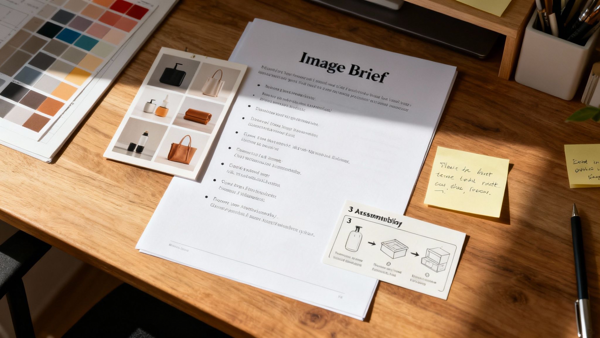
Creating A Visual Brief That Kills Guesswork
All that research you just did? It's completely worthless until you turn it into a concrete plan. The competitor analysis, the review mining—it’s just a pile of raw data until you structure it into a clear, actionable brief for your creative team.
That’s what a visual brief is for. Its sole purpose is to kill the guesswork and make sure every single image is an engineered asset, designed from the ground up to convert shoppers.
A proper brief isn't a list of suggestions; it's a blueprint. It’s the critical link between your strategic findings and the final pixel, preventing you from wasting time and money on visuals that look nice but don’t actually sell anything. Without one, you're just asking a photographer or designer to read your mind, and you’ll almost always get back a set of generic images that fail to address the core objections and motivations of your buyers.
From Raw Data To A Concrete Plan
Let's make this real. Imagine your research uncovered that customers repeatedly complain about "confusing assembly" in your competitor's reviews. Your brief doesn't just say, "Show the assembly." That's lazy, and it won't work.
Instead, a strategic brief translates that specific pain point into a direct command:
- Image 4 Objective: Crush the primary objection of "difficult assembly."
- Core Message: "Setup is simple and takes less than 2 minutes."
- Visual Execution: Create a clean, three-panel infographic. Use icons and minimal text to show a clear Step 1, Step 2, and Step 3. The final panel must show the fully assembled product being enjoyed.
- Tone: Confident, simple, reassuring.
See the difference? This level of detail is non-negotiable. It gives your creative team a specific problem to solve, not just a product to shoot.
The Essential Components Of A Killer Brief
Every image in your stack needs its own mini-brief. For each of the seven slots, you have to define its strategic purpose before a single photo is taken or a graphic is designed. Your document should be ruthlessly clear on these points for every single visual.
- The Job To Be Done: What is the single most important goal of this image? (e.g., "Show the scale and prevent 'smaller than expected' returns.")
- The Target Objection/Benefit: What specific customer pain point or desired outcome, discovered during research, does this image address head-on?
- The Key Takeaway: If a mobile shopper glances at this for only 2 seconds, what is the one message they absolutely must absorb?
- Visual Hierarchy & Callouts: What element should be the hero of the image? What specific text overlays or callouts are required to hammer home the key takeaway?
A great brief forces you to make the hard strategic decisions upfront. It ensures every visual element, from the background color to the font size on a callout, is intentional and serves the ultimate goal of driving conversions.
This process transforms you from a client just hoping for good images into a director orchestrating a visual sales pitch. It’s the difference between being reactive and proactive. If you need help turning your research into a professional brief and finished images, specialized services can execute this entire workflow for you. You can learn more about turning your research into a complete Amazon image stack and see how the pros handle it.
This meticulous planning is what separates seven-figure sellers from everyone else. They get it. They understand that optimizing an Amazon listing doesn't start when you upload a JPEG. It starts with a brief that turns raw customer data into a powerful, persuasive visual argument that leaves competitors looking amateurish and unfocused.
Weaving Your Visuals And Copy Into A Single Story
Your images do the heavy lifting. They stop the scroll, create desire, and handle the initial sales pitch. But once you have a shopper’s attention, your copy has to close the deal.
This is where most sellers get it wrong. They write copy in a vacuum, completely disconnected from their image strategy. A truly optimized Amazon listing is a cohesive unit where every element works together. The title, bullets, and A+ Content are the script for the visual story you've already told.
If your images promise simplicity and durability, but your bullets are just a jumbled list of tech specs, you create a disconnect. That disconnect kills trust and torpedoes your conversion rate.
The goal is seamless reinforcement. The copy validates the visual claims, and the visuals prove the copy's promises.
Architecting A Title For Mobile And Clicks
Your title has two jobs: get you found (keywords) and get you clicked (clarity). The challenge? Over 70% of Amazon traffic is now mobile, where titles get brutally cut short.
You’ve got about 80 characters to convince a shopper to tap your listing over a dozen others. Stuffing this space with a long string of keywords is an outdated tactic that just hurts readability and click-through rate (CTR).
Instead, you have to front-load the most critical information.
- Brand Name: Lead with your brand to build recognition.
- Core Product Identity: State exactly what the product is.
- Primary Benefit/Use Case: Address the main problem you solve with your top keyword.
- Key Differentiator: Mention the one thing that makes you the obvious choice.
This structure ensures that even when the title is cut off, it still communicates the most compelling reason to click. It’s a delicate balance. High-converting listings front-load their primary keywords while keeping it readable for mobile shoppers. This simple tweak aligns with Amazon's A10 algorithm, which rewards relevance and a good customer experience.
Writing Bullets That Answer, "So What?"
Your bullet points are not a feature list. Think of them as an expansion of the benefits you’ve already showcased in your images. Each bullet should take a visual promise and flesh it out, answering the customer's silent question: "So what?"
If your infographic shows a "3-Layered Comfort System," your corresponding bullet shouldn't just repeat that. It needs to translate that feature into a tangible benefit.
Weak Bullet: "Features a 3-layered comfort system with memory foam."
Strong Bullet: ALL-DAY SUPPORT FOR PAIN RELIEF: Our unique 3-layer system combines a firm support core with a plush memory foam top, cradling your joints to reduce pressure and eliminate discomfort. Stop tolerating pain and start moving freely.
See the difference? This approach connects the visual evidence (your infographic) with an emotional outcome (pain relief, freedom). It makes the benefit feel real and urgent. For a foundational understanding of how search engine optimization works, check out these SEO basics for small businesses.
Structure each bullet with a capitalized, benefit-driven headline. Follow it with a short sentence or two that explains how you deliver that benefit. This format is incredibly scannable and directly reinforces your visual sales pitch.
Using A+ Content To Close High-Consideration Sales
A+ Content is where your brand story and visual strategy come together to crush the most complex objections. Standard images are great for quick takeaways, but A+ Content lets you build a richer, more immersive narrative. This is how you justify a premium price and build real brand equity.
Don't just reuse your main images here. Use A+ Content to go deeper.
- Show, Don't Just Tell: Use comparison modules to visually prove your superiority over generic alternatives. This reinforces what your fifth or sixth image slot already introduced.
- Tell Your Brand Story: Dedicate a module to your brand's origin, mission, or commitment to quality. This builds an emotional connection that commodity sellers simply can't replicate.
- Overcome Complex Objections: If your product requires a nuanced explanation—like how a specific technology works or why your materials are superior—use a combination of text and custom graphics to break it down simply.
Ultimately, your copy and keywords aren't separate from your images; they're the essential supporting cast. When your title, bullets, and A+ Content are perfectly aligned with your visual strategy, you create a seamless, persuasive argument that leaves no room for doubt. The shopper feels understood, their questions get answered, and the path to purchase becomes frictionless.
Conclusion: Stop Optimizing and Start Engineering
If you take one thing away from this guide, let it be this: optimizing your Amazon listing isn't about tweaking keywords or A/B testing a headline. It's about engineering a visual argument so compelling that the customer can't imagine buying from anyone else.
Your images are the single biggest lever you can pull to increase traffic, conversion rate, and profitability. They are a force multiplier for your PPC, a driver for your organic rank, and the foundation of your brand on the platform.
Treat them with the strategic importance they deserve. Move from guessing to knowing. Build your visual strategy on a foundation of hard data—competitor weaknesses, customer objections, and search intent. Do the research, write the brief, and demand that every pixel works to close the sale. That is how you win.