How to Increase Amazon Product Sales with Strategic Listing Images
Let's get one thing straight. The single biggest lever you can pull to increase your Amazon sales isn't your PPC budget or some keyword-stuffing trick—it's your product images. In a marketplace where a buying decision happens in under three seconds, your visuals are your entire sales pitch.
This guide isn't about the usual tactics. It’s for experienced sellers who understand that traffic is pointless without conversion. It’s about focusing on the one asset that dictates your click-through rates, your conversion, and ultimately, your profitability.
Why Your Images Are the Ultimate Sales Multiplier
Most Amazon sellers treat their marketing like a disconnected checklist. They run PPC, tweak keywords, play with pricing, and then wonder why sales are flat. They throw money at ads, trying to force traffic to a listing that isn't built to convert.
This is an expensive, backwards approach.
The hard truth is that no amount of ad spend can save a listing with weak visuals. Your product images are the foundation. Get them right, and they become a force multiplier that makes every single dollar you spend on advertising work harder, improves your organic ranking, and even justifies a higher price point.
Your images sell first; your copy sells second. In a crowded digital aisle, the customer's first glance determines whether they click or scroll. Winning that initial engagement is the entire game.
The Real Job of Your Amazon Images
A high-performing image stack does more than just show what a product looks like. It’s a strategic tool designed to get a specific job done. Its primary roles are to:
- Stop the Scroll: Your main image has one job: cut through the visual chaos of the search results and earn the click. If it fails here, nothing else matters.
- Communicate Value Instantly: Shoppers don't read; they scan. Your secondary images must land the most critical benefits and features in seconds, using clear visuals and minimal text.
- Build Trust and Overcome Objections: Good lifestyle shots and infographics answer a buyer's unspoken questions. They tackle their hesitations head-on and build the confidence they need to actually click "Add to Cart."
- Justify a Higher Price: Premium, well-executed images create the perception of higher quality. This gives you more pricing power and protects your margins from the race to the bottom.
When you focus on your images first, you're not just decorating a product page—you're building a high-performance conversion machine. This image-first philosophy is the core of how we create research-driven Amazon listing images that deliver real, measurable results.
While optimizing images is a powerful lever, for a holistic approach to boosting your overall performance, consider exploring broader strategies on how to increase online sales. But remember, investing in strategic visuals is the single most effective way to turn casual browsers into loyal customers and fundamentally change your sales trajectory.
Deconstructing the Perfect Amazon Image Stack
Most sellers treat their secondary image slots like a random photo gallery. This is a massive, sales-leaking mistake. A high-converting listing doesn't have a photo gallery; it has a deliberate visual sales funnel. Each of your image slots has a specific job to do, guiding the buyer from casual interest to a confident "Add to Cart."
Your image carousel isn't a passive display. It's an active conversion machine that needs to be engineered with precision.
Let's break down the strategic role of each image and the buyer psychology that makes it work. The entire path from discovery to purchase is a rapid, three-step process driven almost entirely by what shoppers see.
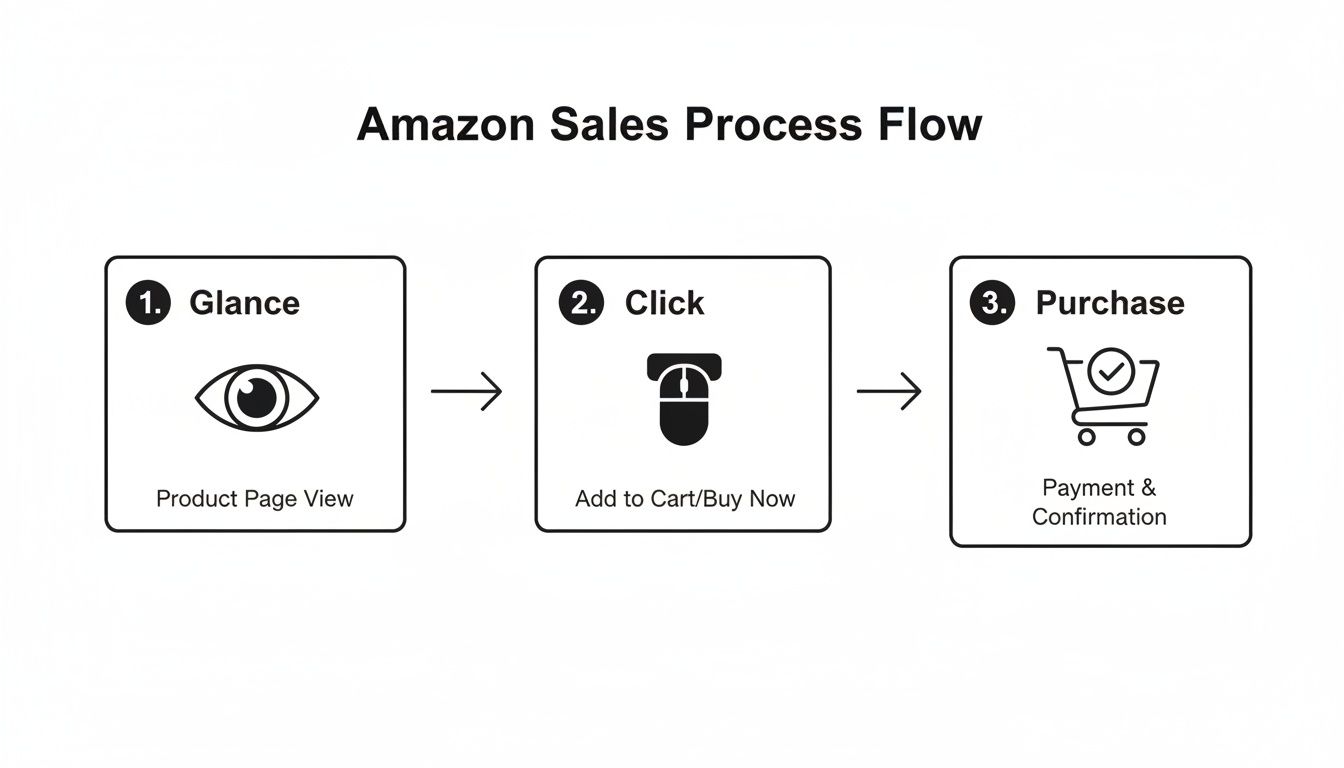
This flowchart highlights a brutal reality: your images must stop the scroll, earn the click, and then secure the sale—all in a matter of seconds.
To make this happen, you need a full image stack where every visual pulls its weight. This isn't about just having seven pretty pictures; it's about building a visual argument that leaves no room for doubt.
The High-Conversion Amazon Image Stack
This table breaks down the specific role each image plays in your visual sales funnel. Think of it as your strategic blueprint.
| Image Slot | Primary Goal | Key Elements | Common Mistake |
|---|---|---|---|
| 1: Hero Image | Stop the Scroll & Earn the Click | Clean, high-res, pure white background, shows the entire product clearly. | Low-res files, distracting props, or angles that obscure what's for sale. |
| 2: Lifestyle/Context | Build Aspiration & Connection | Show the product in a realistic scene, demonstrating the desired outcome or feeling. | A generic stock photo that feels disconnected from the product or the customer. |
| 3: Infographic | Communicate Key Benefits | Minimal text, strong icons, focuses on the top 2-3 benefits, easily scannable on mobile. | A cluttered "wall of text" that tries to cram every single feature onto one image. |
| 4: Feature Callout | Reinforce Value & Quality | Uses arrows or zoom-ins to highlight a specific premium material, design feature, or spec. | Highlighting a generic feature that doesn't actually differentiate it from competitors. |
| 5: Social Proof | Establish Trust & Reduce Risk | Showcases a glowing review, an award, a "Best Seller" badge, or a powerful statistic. | Using fake or unconvincing social proof that looks photoshopped or untrustworthy. |
| 6: Objection Handler | Neutralize Buyer Hesitation | Visually addresses the #1 pain point or complaint found in competitor reviews. | Guessing at objections instead of using real customer data from reviews. |
| 7: Comparison Chart | Close the Deal & Prevent Exit | Compares your product to 2-3 competitors on key features, making yours the obvious choice. | A confusing chart that isn't easy to read or that compares irrelevant features. |
Each of these images builds on the last, creating a seamless narrative that answers questions, removes doubt, and makes the purchase feel like a smart, easy decision.
Of course, none of this works if your images don't meet Amazon's technical rules. You absolutely must follow the official Amazon product image requirements to ensure your listing stays compliant.
The data backs this up. High-quality images can boost click-through rates by up to 20% on search results alone. But the real magic happens on the listing itself: sellers with a complete, strategic image stack often see add-to-cart rates jump by 30-40% because a complete visual funnel simply leaves fewer reasons for a shopper to click away.
Research Is How You Create Images That Actually Sell
Elite Amazon images don’t come from guesswork. They’re built on a foundation of solid data.
The fastest way to waste money is to hire a photographer without a research-backed brief. The difference between images that just look good and images that actually move the needle on sales is the intelligence behind them.
This isn’t about waiting for a flash of creative genius. It’s about a repeatable framework that turns raw data into a precise creative brief for images that convert. We’ll focus on three core pillars that, when combined, give you an almost unfair advantage.
Deconstruct Your Top Competitors
Your best competitors are already showing you what works on Amazon. Your job is to systematically pull apart their visual strategy to find the patterns, strengths, and weaknesses you can exploit.
Don’t just glance at their listings; dissect them.
Open up the top 10 listings for your main keyword. Go through every single image slot, from the hero to the very last infographic. Ask yourself specific questions:
- What’s the main benefit they’re pushing in their lifestyle shots?
- How are they using infographics? Are they cluttered, or are they clean and easy to read on a phone?
- Which specific features are they calling out with text or zoom-ins?
- Do you see any recurring themes, color palettes, or icon styles?
The point here isn't to copy. It's about understanding the established visual language in your niche so you can find the gaps. If everyone is using the same generic lifestyle shot, your opportunity is to show the product solving a specific, high-pain problem. If their infographics are just boring walls of text, yours can win with clean, benefit-driven icons.
The goal of competitor analysis is not imitation, but strategic differentiation. Find the one visual message they are all failing to communicate, and make that the core of your own image stack.
Mine Customer Reviews for Raw Intelligence
Customer reviews are the single most valuable source of creative intelligence you have. They are a direct pipeline into the buyer's mind, telling you their exact frustrations, desired outcomes, and lingering doubts—all in their own words.
Stop guessing what matters to your customers. Just start listening.
Go through your own reviews, and more importantly, the reviews of your top three competitors. Isolate the exact language people use when they’re thrilled (5-star) or furious (1-star).
- Positive Reviews: Find the phrases customers use to describe the main benefit. "This was so easy to assemble" becomes the inspiration for an infographic that highlights simplicity.
- Negative Reviews: Pinpoint the most common complaints. "I thought it would be bigger" is a clear signal that your images need to show scale and dimensions. "The instructions were terrible" is a golden opportunity to create a visual "how-to" image.
This data is gold. It lets you create images that speak directly to a real person's experience, answering their questions and calming their fears before they even think to ask. For a deeper dive into this kind of content strategy, check out more insights on our Amazon seller blog.
Uncover True Search Intent
Finally, you must look past the keywords to understand what a customer is really trying to accomplish when they type something into the search bar.
"Waterproof hiking boot" isn't just a keyword; it's a mission. That customer is planning an adventure and wants to avoid the misery of wet, cold feet. Their search is driven by a need for comfort, reliability, and security on the trail.
Your images must connect with that underlying motivation. A simple studio shot of the boot on a white background doesn’t cut it. But a lifestyle image of someone confidently crossing a stream or hiking through a downpour? That speaks directly to the searcher's core need.
To get to the bottom of search intent, think about the context behind your main keywords. What problem is the searcher trying to solve? What outcome are they hoping for? This kind of thinking turns a simple product photo into a compelling visual story that connects on an emotional level, which is what truly drives conversions.
Applying Visual Hierarchy and Mobile-First Design
Your product images live or die on a mobile screen. It's that simple. With over 70% of Amazon traffic now coming from mobile devices, any visual that isn't built for a four-inch screen is basically invisible. If your visual strategy isn’t mobile-first, it's a strategy designed to fail.
This isn’t about shrinking your desktop images. It’s a total shift in thinking. You have to prioritize immediate clarity, because on mobile, you have less than two seconds to communicate value before the thumb keeps scrolling.
Guiding the Eye with Visual Hierarchy
Visual hierarchy is just a fancy term for controlling where a shopper looks first. It’s non-negotiable for infographics and lifestyle images that actually work. Without it, your image is just a cluttered mess that forces the shopper to think. They won't. They'll just leave.
Think of it like a newspaper headline. The most important message is the biggest and boldest. Everything else is secondary. The goal is to make the main benefit so obvious it can be understood in a single glance.
A classic mistake is giving every feature on the image the same visual weight. When five different callouts have the same font size and color, nothing stands out. You’ve just created visual noise that communicates nothing and converts no one.
The core principle of mobile-first design is brutal simplicity. If a shopper has to pinch and zoom to read your text or understand your graphic, you have already lost the sale. Your images must be instantly digestible.
To get this right, you have to decide on the single most important takeaway for each image. Is it the product's durability? Its ease of use? Its primary benefit? That one message gets top billing. Everything else just supports it.
Designing for the Thumb Zone
On a small screen, scannability is everything. Your design choices have to be ruthless and efficient if you want to increase Amazon product sales in a mobile world.
- Fonts and Text Size: Forget about delicate, thin fonts. Use bold, sans-serif fonts like Helvetica or Montserrat that stay legible even when tiny. Keep your text to an absolute minimum—think five to seven words max per callout. If you need a full sentence, that message belongs in your bullet points, not your image.
- Color and Contrast: High-contrast color pairings make key information pop. A bright, on-brand color for a key benefit against a neutral background is an instant eye-catcher. Avoid disasters like light gray text on a white background, which completely disappears on a phone.
- Negative Space: Crowded images create anxiety and look cheap. Negative space—the empty area around your design elements—gives your product and key messages room to breathe. It guides the viewer's focus and creates a sense of premium quality.
Real-World Mobile Design Wins and Fails
Let's make this practical. Imagine you're selling a high-end blender.
- The Mobile-First Fail: An infographic packed with eight tiny icons and even tinier text listing every single spec—wattage, blade speed, container material. On a desktop, it might be readable. On a phone, it’s an illegible blur. The customer learns nothing and scrolls on.
- The Mobile-First Win: A clean infographic with one large, bold headline: "Smoothies in 30 Seconds." Below it, a simple icon of a clock. The rest of the image is just the blender looking great. This image communicates the primary benefit—speed—instantly. It’s clean, confident, and perfect for a quick glance.
This is the level of discipline it takes. Every single pixel on your image must serve one goal: reduce friction and drive the "Add to Cart" click, no matter the device. Get this right, and you’re not just optimizing images; you’re building a frictionless path to purchase where it matters most.
Measuring the ROI of Your New Product Images
Spending money on research-driven, professional images isn't an expense—it's an investment. And it's a measurable one.
Too many sellers get this backward. They treat image creation as a creative cost to be squeezed, not as a strategic asset designed to drive sales. This section gives you the framework to prove the value with cold, hard data.
If you can't measure the impact, you're just guessing. We'll break down the exact key performance indicators (KPIs) to track before and after you update your images, turning what feels like a subjective decision into a data-backed business case.

Primary Metrics to Track Before and After
These numbers tell you directly if your images are working. You need a baseline before you touch anything. Pull a 30-day report on these three metrics before uploading your new images, then track them for the 30 days right after.
- Click-Through Rate (CTR): This is the ultimate test of your main image. A higher CTR means your hero shot is doing its job—stopping the scroll and beating competitors in crowded search results. An increase here is the very first sign of success.
- Unit Session Percentage (CVR): This is your conversion rate, and it’s the most important metric for your secondary images. An improved CVR proves your new lifestyle shots and infographics are effectively answering questions, crushing objections, and building trust.
- Add to Cart Rate: This is an often-overlooked metric that signals strong buying intent. A shopper might not check out immediately, but adding your product to their cart means your visuals have convinced them it's the right choice.
Don't get lost in vanity metrics like impressions. The only numbers that matter are those that directly measure a customer's decision to click, consider, and commit. Your images are built to influence these specific actions.
Secondary Effects That Prove ROI
The impact of great images ripples out far beyond the listing itself. They act as a force multiplier, making all your other marketing efforts more efficient and profitable.
Improved PPC Performance Better images lead directly to better ad performance. When your main image earns a higher CTR, your ads become more relevant in Amazon’s eyes. This almost always results in a lower Cost-Per-Click (CPC) and a better Advertising Cost of Sale (ACoS) because you're getting more clicks and conversions from the exact same ad spend.
Reduced Negative Reviews One of the most common reasons for 1-star reviews is a mismatch between expectation and reality. Vague, low-quality, or misleading images are a huge cause of this. Clear, accurate, and detailed visuals set precise expectations about size, color, and features, which drastically cuts down on returns and negative feedback related to "not as described."
How to Quantify the Impact with A/B Testing
For the final, undeniable proof, nothing beats a split test. Amazon's "Manage Your Experiments" tool is built specifically for this, letting you run your new main image against the old one head-to-head.
The process is simple:
- Navigate to "Manage Your Experiments" in Seller Central.
- Choose "Product Main Image" as the experiment type.
- Upload your new main image as Version B.
- Run the experiment for the recommended time (usually 4-10 weeks).
Amazon automatically splits traffic between the two versions and declares a winner based on statistically significant conversion data. This removes all guesswork. It's undeniable proof of which image generates more sales.
For sellers ready to turn this kind of research into real results, you can get a full, data-driven image stack designed specifically to win these tests and drive conversions.
The Uncomfortable Truth About Stagnant Amazon Sales
Let’s be blunt. If your Amazon sales have gone flat, the problem probably isn’t your ad budget or keyword strategy. It's your images.
Sellers are judged and dismissed in seconds based on their visual presentation alone. It's a brutal reality of the platform. Countless sellers pour weeks and thousands of dollars into fine-tuning their PPC campaigns while leaving their most critical sales asset—their product images—untouched for years.
This is a fundamental misunderstanding of how sales work on Amazon. Sending traffic to a listing with weak, uninspired visuals is like trying to fill a bucket with a massive hole in the bottom. You can pour traffic in all day; it just leaks out.
The central takeaway is this: your listing images are the single highest-leverage asset you have. They impact everything from click-through rates on your ads to your organic ranking and how much you can charge.
Stop treating your images like a one-and-done setup task. They are the core of your conversion engine.
The path to scaling your sales isn't about doing more things; it's about doing the single most important thing far better. And on Amazon, that will always be your product images. They are the engine.
When you're ready to make your visuals the priority they need to be, a research-driven image strategy can fundamentally change your results.
Got Questions About Amazon Image Optimization?
Even seasoned sellers run into the same questions when dialing in their visual strategy. Let's cut through the noise and get straight to what works.
How Often Should I Actually Update My Product Images?
Forget the calendar. This isn't about a quarterly refresh. You should update your images the moment you have new data that points to a better angle.
It's time for a strategic update if:
- Your conversion rate has been flat or dropping for 30 days or more.
- A new competitor is suddenly eating your lunch with superior visuals.
- Your customer reviews are screaming about a pain point or a benefit you aren't showing.
- You fire up a PPC campaign and your click-through rate is tanking compared to the category average.
Your images are a dynamic sales tool, not a "set it and forget it" asset. Treat them that way.
Can Better Images Really Let Me Charge a Higher Price?
Absolutely. In fact, it's one of the only ways to do it. Price sends a signal, and your images are the evidence that backs it up. Cheap, blurry, or low-effort photos scream "bargain bin," forcing you into a race to the bottom on price.
On the flip side, professional, research-driven visuals create a powerful perception of value. They build instant trust, highlight premium materials, and tell a story that makes the customer feel smart for choosing you. That confidence makes the price tag feel like a non-issue. It’s the difference between selling a commodity and selling a solution.
What's the Single Biggest Mistake Sellers Make with Images?
Easy. Designing images based on what the seller thinks is cool or important, instead of what customers have already told them they care about.
Wasting an image slot on a generic “high quality” graphic while ignoring the #1 complaint in your 1-star reviews is a complete failure of strategy. Your gut feel is not a replacement for cold, hard customer data.
Every single image in your listing needs to be a direct answer to a known customer motivation or a direct counter to an objection you found in your research. Anything else is just decoration, and decoration doesn't move the needle.
Ready to stop guessing and turn your listing into an active conversion machine? ProductShots builds a complete, research-driven image stack designed to stop the scroll, crush objections, and drive sales. Get your high-converting Amazon images today.