
Amazon Product Image Requirements: A Strategic Guide for Operators
Amazon's technical image specs aren't arbitrary rules. They are the foundation for a customer experience that directly impacts your conversion rate and profitability. Getting them wrong means you're suppressed before you even start.
The core requirements are simple: JPEG, PNG, or TIFF formats, at least 1000 pixels on the longest side to enable zoom, and the sRGB color mode. These aren't suggestions; they're the price of entry to the marketplace. Violating them wastes ad spend and kills sales velocity.
The Non-Negotiable Technical Specifications
Ignoring Amazon’s technical requirements is a fast track to listing suppression and a broken customer experience. Mastering these specs is the first step to turning your images from a liability into a conversion asset.
Over the last decade, Amazon's standards have only become stricter. While 1000 pixels is the technical minimum to enable zoom, any serious operator knows that 2,000 x 2,000 pixels is the real standard for a sharp, premium look that builds buyer confidence. Aiming for the minimum is a losing strategy.
Key Takeaway: Technical compliance isn't about checking a box. It's about enabling the single most critical conversion feature on your listing: the zoom function. Zoom allows buyers to inspect product quality and detail, building the trust required to click "Add to Cart."
This reference table summarizes the essentials. Get them right every time.
Amazon Technical Image Requirements At a Glance
| Requirement | Specification | Consequence if Ignored |
|---|---|---|
| Minimum Resolution | 1,000 pixels on the longest side | Zoom function disabled, reduced buyer confidence, potential listing suppression. |
| Recommended Resolution | 2,000 x 2,000 pixels or larger | Poor zoom quality, unprofessional appearance next to competitors, lost sales. |
| Accepted File Formats | JPEG, PNG, TIFF | Image upload will fail. |
| Preferred File Format | JPEG (.jpg) | Slower page load times (with PNG/TIFF), negatively impacting conversion. |
| Color Mode | sRGB (Standard Red Green Blue) | Distorted, inaccurate colors on the listing, damaging brand perception and increasing returns. |
| File Naming Convention | Product Identifier (ASIN, JAN, etc.) + variant code + .filetype | Images may not map to the correct child ASIN, causing confusion and lost sales. |
Getting these basics right is non-negotiable. It ensures your images not only display correctly but also function as effective sales tools.
File Formats and Sizing
Amazon accepts several standard image formats, but for performance, one is the clear winner.
- JPEG (.jpg): This is the gold standard for Amazon. It delivers the best balance of high image quality and small file size, which is critical for fast page load times and mobile CVR. The vast majority of your images must be JPEGs.
- PNG (.png): The only valid use case for a PNG is a transparent background for a specific graphic in a secondary image. Be aware that PNG files are larger and can slow your listing's load time. Use them sparingly and strategically.
- TIFF (.tif): Avoid TIFFs. They are uncompressed and massive, offering zero practical advantage over a high-quality JPEG for web use. They will only hurt your page speed and conversion rate.
Resolution and Color Mode
These are simple but costly mistakes that erode buyer confidence and get listings suppressed.
- Resolution: The absolute floor is 1000 pixels on the longest side. Anything smaller disables the zoom function—a dealbreaker for most shoppers. The professional standard for a premium feel is 2000 x 2000 pixels or larger.
- Color Mode: Every image must be saved in the sRGB (Standard Red Green Blue) color space. This is the universal standard for the web, ensuring your product colors are accurate across all devices. Uploading in CMYK (for print) will result in distorted, bizarre colors on your listing, which screams unprofessional and misleads the buyer.
For more deep dives on creating Amazon content that actually converts, check out what we're covering on our blog.
Mastering the Main Image for Maximum Click-Through Rate
On a crowded search results page, your main image is your primary CTR lever. It's your only opportunity to stop the scroll and earn the click. A weak main image renders your title and price irrelevant.
This isn't just about aesthetics; it's about following Amazon's rigid, non-negotiable rules. Violating them gets your listing suppressed, killing visibility and sales overnight. Think of main image compliance as the first and most important hurdle to clear.

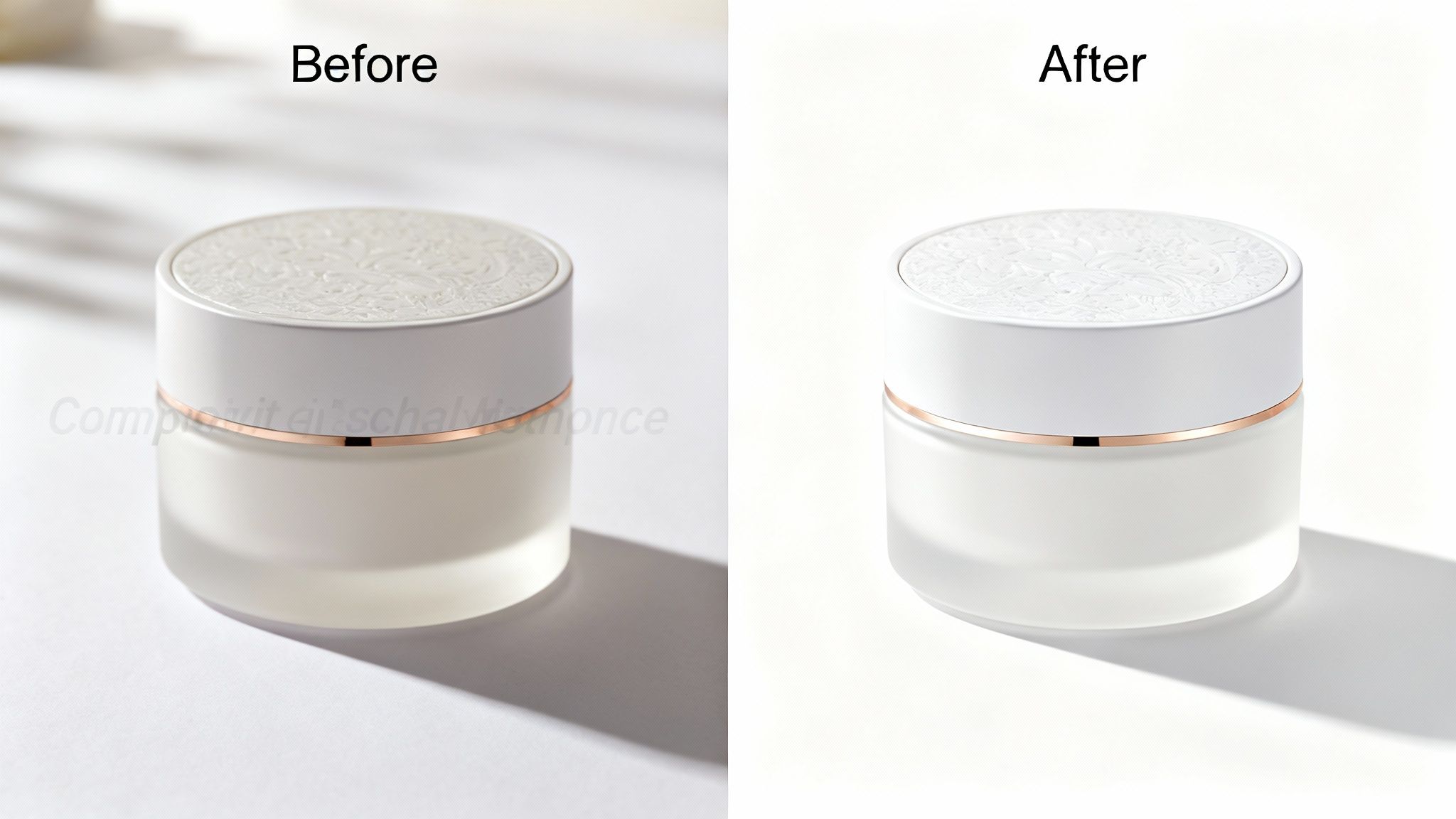
The Pure White Background Rule
The most critical—and most common—mistake sellers make is with the background. Amazon demands a pure white background, specifically RGB (255, 255, 255). "Almost white," light grey, or a photo taken against a physical white wall is a direct policy violation that will lead to suppression.
This isn't an arbitrary aesthetic preference. The pure white backdrop removes all distractions and creates a consistent, trustworthy shopping experience across the platform. It forces the buyer's eye directly onto your product.
Forbidden Elements on Main Images
To maintain a clean, product-first focus, Amazon strictly forbids adding anything extra to the main image. Adding any of the following is a fast track to getting your listing suppressed.
- No Text, Logos, or Watermarks: The image must be the product, and only the product. No brand logos, no "Made in the USA" badges, and absolutely no promotional text like "Sale" or "New Arrival."
- No Props or Accessories: If it's not included in the purchase, it cannot be in the main image. Including accessories that are sold separately is a major policy violation that misleads the customer and invites negative reviews.
- No Illustrations or Placeholders: Your main image must be a real photograph of the actual product. You cannot use drawings, 3D renders, or icons as your primary hero shot.
The 85% Rule and Product Framing
The product itself must fill at least 85% of the total image area. This rule ensures the product appears substantial and clear, allowing shoppers to see important details at a glance. A tiny product floating in a sea of white space looks cheap and gets ignored.
This is especially crucial for mobile shoppers, where screen real estate is precious. A product that fills the frame is instantly recognizable on a small screen, which directly impacts whether you win the click. Beyond the technical rules, learning how to take good product shots that sell is what separates top operators from amateurs.
And if you'd rather not deal with the hassle, you can always place an order for professional product shots built from the ground up to meet these rules and convert shoppers.
Building a High-Conversion Secondary Image Stack
Your main image got the click. Now the real selling begins.
Your secondary images are your silent sales team on the detail page. Their job is to systematically dismantle buyer hesitation, spotlight value, and drive the "Add to Cart" click. A random gallery of product shots is a wasted opportunity. You need a strategic stack where each of your six primary image slots has a specific, conversion-focused role.
This isn't about guesswork. It’s about mining customer reviews and competitor listings to find out what buyers actually care about. You're looking for recurring questions, features people rave about, and common complaints. Those insights are your roadmap for creating visuals that connect and sell.

A Strategic Framework for Your Six Image Slots
Treat your six secondary image slots like a visual sales pitch. Each one must answer a question or reinforce a key benefit before the shopper has to read the bullet points or A+ Content. Wasting a slot on a redundant angle of your product is a critical, costly mistake.
Here is a battle-tested framework for assigning a role to each image. This is how you turn a simple gallery into a conversion machine.
Strategic Framework for Secondary Image Slots
This table lays out a structured plan for using each of your six primary secondary image slots. The goal is to address specific buyer needs at each step, building confidence and momentum toward purchase.
| Image Slot | Strategic Purpose | Content Example |
|---|---|---|
| Image 2 | Lifestyle/Context | Show the product in its intended environment. Help the buyer visualize owning it and feel the end benefit. |
| Image 3 | Key Feature Infographic | Call out the single most important feature with bold text and icons. Focus on the benefit, not just the tech spec. |
| Image 4 | Dimension/Scale Graphic | Clearly show the product's size, dimensions, or capacity. This answers the "Will it fit?" question and reduces returns. |
| Image 5 | Benefit Infographic 2 | Tackle the second most important buying driver or a major pain point your product solves. |
| Image 6 | Comparison Chart | Put your product next to a generic alternative or an older model to establish superior value. Make the choice obvious. |
| Image 7 | "How to Use" or Social Proof | Use a simple step-by-step guide, a "What's in the Box" graphic, or a collage of review quotes to build trust and close the sale. |
Following a structure like this systematically breaks down purchase barriers. You build confidence with every swipe.
Mining Reviews to Identify Conversion Triggers
Your best image concepts are hiding in plain sight: inside your competitors' customer reviews.
Go through the top 10 competing listings and filter for 3-star and 4-star reviews. This is where you find the gold—what customers liked, but also what they wished was better or clearer.
- Positive Mentions: If dozens of reviews praise a specific feature ("the battery life is incredible"), that is a primary benefit you must feature in an infographic.
- Recurring Questions: Do shoppers keep asking about the material, the size, or compatibility? Answer that question visually with a dedicated image to remove friction.
- Negative Feedback: If a competitor's reviews complain about a product being "smaller than expected," you have a clear mandate to create a dimension graphic and prevent the same issue and subsequent negative reviews.
Common Mistake: Many sellers just list product features. This is a rookie move. You must translate features into tangible benefits. Instead of saying "5000 mAh Battery," your image must say "All-Day Power for Work and Play." One is a spec; the other is a solution.
Building Your Visual Narrative
Once you've mapped your top insights to the framework, ensure the images flow logically. A customer should be able to swipe through them and understand your product's entire value proposition without reading a single word of copy. This visual-first approach is crucial for mobile shoppers, who are far more likely to engage with images than dense blocks of text.
Your image stack is your primary conversion tool. By investing in research-driven visuals, you speak directly to buyer psychology, make your PPC spend more efficient by converting more clicks, and can ultimately command a higher price. If you need a hand turning these insights into a powerful visual story, services that create research-driven Amazon listing images can execute this entire strategic process for you.
How Your Images Control Amazon's A9 Algorithm
Most sellers think Amazon ranking is just about keywords and sales velocity. That’s a massive blind spot. Your images are one of the most powerful data points you feed to Amazon’s A9 algorithm, which is laser-focused on one thing: promoting products that are most likely to convert.
The algorithm doesn't "see" a good photo. It measures user behavior. When a shopper lands on your page and interacts with your images—zooming in, clicking through the whole stack—it increases their session time. This tells A9 your product is engaging. A weak, incomplete image set gets a quick bounce, signaling your listing is irrelevant.
Connecting Images to The Metrics That Matter
The line between your visuals and organic rank is direct. Your images are the primary drivers for the two metrics that A9 cares about most: Click-Through Rate (CTR) and Conversion Rate (CVR).
Click-Through Rate (CTR): Your main image has one job in search results: earn the click. A crisp, compelling hero shot that pops against the competition will always generate a higher CTR. A9 sees this as proof of relevance and rewards you with better visibility.
Conversion Rate (CVR): Once they click, your secondary images must close the deal. A strategic image stack that answers questions, crushes objections, and demonstrates value will turn more browsers into buyers. A higher CVR tells the algorithm your product delivers, which directly fuels your rank over time.
This isn't theory; it's how the system is built. Amazon constantly crawls listings and analyzes image data to match products with the right shoppers. For instance, images under 500 pixels on their longest side are flat-out rejected, setting a hard baseline for quality. You can learn more about how Amazon analyzes image data directly from their engineers.
Your Images Are a Performance Multiplier
Treating images as a simple checklist item is a strategic mistake. They are a force multiplier for every other activity on your account. Better images drive a higher CVR, which makes your PPC campaigns more profitable by converting more of the clicks you already paid for.
A higher conversion rate from optimized images improves your unit session percentage—a critical metric for the A9 algorithm. This improved performance tells Amazon your listing is a winner, leading to a virtuous cycle of more visibility, more traffic, and more sales.
Ultimately, this isn't about tricking the algorithm. It's about acknowledging that A9 is built to reward sellers who create a superior customer experience. A smart, strategic image stack is the most effective tool you have to provide that experience, making it your single most powerful lever for winning on Amazon.
Common Image Rejection Issues and How to Fix Them
A listing suppression notice is a frustrating, expensive, and entirely avoidable problem. When Amazon's algorithm flags an image, your listing vanishes, sales stop cold, and your ad spend is wasted.
The good news is that most suppressions aren't from obscure rules. They are caused by a handful of simple, repeated mistakes that are easy to fix. The key is knowing what to look for so you can diagnose the problem, upload a compliant image, and get back online fast.
Troubleshooting Main Image Violations
Your main image is the primary offender, responsible for over 90% of all image-related suppressions. The rules here are rigid and absolute. If your listing gets flagged, check these common culprits first.
Non-White Background: The background must be pure digital white (RGB 255, 255, 255). "Almost white," light gray, or a photo against a physical white wall will be flagged.
- Fix: This is non-negotiable. Use an editing tool to properly cut out the product and place it on a pure white canvas. Learning how to effectively remove unwanted shadows from your product images is also critical, as even subtle shadows can trigger a rejection.
Unauthorized Text or Logos: Your main image must show only the product. No text, badges, or watermarks. No exceptions.
- Fix: Upload the original, clean product shot without any graphical overlays. Save text and logos for secondary images where they are permitted.
Incorrect Product-to-Frame Ratio: The product itself must fill at least 85% of the image frame. A product that looks small in a sea of white space will be suppressed.
- Fix: Crop the image tighter. Get close to the product edges, leaving just enough white border to avoid cropping any part of the product itself.
Fixing Secondary Image and General Policy Errors
While you have more creative freedom with secondary images, they still have rules that can get your listing suppressed.
Low-Resolution Uploads: Every image must be at least 1,000 pixels on its longest side to enable Amazon's zoom feature. Anything smaller will be rejected.
- Fix: Go back to your source file and export a high-resolution version. Do not simply scale up a small image—it will look blurry and pixelated, which kills conversions.
Promotional Language: You cannot put pricing, shipping details, or time-sensitive words like "Sale" or "New" on your images.
- Fix: Rework any text to focus on features and benefits. Remove anything that sounds like a marketing callout or a direct sales pitch.
Misleading Content: This is a serious violation. If you show props, accessories, or multiple units in a photo that aren't actually included in the purchase, you're violating policy and misleading customers.
- Fix: Be brutally honest. Your images must show exactly what the customer receives. If clarification is needed, use a "What's in the Box" infographic in your secondary slots.
If you’re stuck in a loop of rejections or want an expert eye to ensure compliance, you can always reach out for a professional image audit. A proactive review is always cheaper than a sales-killing suppression.
Mobile-First Image Design Is Non-Negotiable
Designing for desktop is one of the most expensive mistakes an Amazon operator can make. With well over half of Amazon’s traffic coming from mobile devices, your images are being judged on a four-inch screen, not a 24-inch monitor. If your visuals aren’t built for this reality, your conversion rate is leaking money with every visitor.
Mobile-first design isn’t about shrinking desktop images. It's a completely different strategic approach. Shoppers on their phones scroll faster and have zero patience. Your images must communicate value instantly, with zero friction. This means every visual element needs to be bigger, bolder, and simpler than you think.

Adapting Your Visuals for Small Screens
What looks great on a large monitor often becomes an unreadable mess on a smartphone. Complicated infographics and busy lifestyle shots are the worst offenders. To win on mobile, you must be ruthless about clarity and impact.
- Large, Legible Text: Use a bold, simple font. Keep text to an absolute minimum—think five to seven words maximum. If a shopper has to pinch and zoom to read your text, you've already lost.
- Simple Compositions: Every image needs one, and only one, unmistakable focal point. Eliminate distracting backgrounds and use negative space to pull the eye directly to the product or its key benefit.
- High-Contrast Design: Use bold colors that pop. Subtle, sophisticated color palettes that look premium on a large monitor can appear washed out and indistinct on a smaller, dimmer mobile screen.
The Mobile Litmus Test
Before you upload any image, perform this simple test: pull it up on your smartphone and hold it at a normal distance. Can you understand the main benefit in less than three seconds without squinting? If the answer is no, it’s not ready. Go back and edit.
Common Mistake: Detailed comparison charts loaded with tiny text and a dozen columns are completely useless on mobile. A superior mobile-first approach is a dead-simple, side-by-side image showing your product next to a generic one, with a large checkmark on your side and an "X" on the other. The value proposition is immediate and requires no effort from the buyer.
Your entire image stack must be viewed through this mobile lens first. By designing for the majority of your shoppers, you ensure your message actually lands, which directly fuels your add-to-cart rate and sales velocity. Stop treating mobile as an afterthought; it is the main event.
Frequently Asked Questions
Even with a comprehensive guide, experienced operators often have specific tactical questions. Here are the most common ones.
Image Slots and Usage
How many product images can I actually use on an Amazon listing? You have nine total slots: one main image and eight secondary spots. However, only the first seven images (your main plus the first six secondary) reliably display on the desktop product page.
While the last two slots can be indexed, do not rely on shoppers seeing them. Your entire visual sales pitch must be executed in those first seven images.
Can I put text and logos on my secondary images? Yes, and you absolutely should. This is where you build infographics that communicate key features and benefits. However, you must avoid promotional language like "Sale," "Best Seller," or shipping information. Amazon will flag and suppress this immediately.
Any claims you make must be accurate and verifiable. Logos are generally not permitted unless they are physically part of your product or its packaging.
Technical and Naming Conventions
What's the right way to name my image files for Amazon? This is a critical technical requirement. Amazon’s system is rigid and uses a specific file naming format to map images to the correct product. An error here means your images will not display.
The format is your product identifier (ASIN, UPC, or EAN), followed by a period, and then the file extension. For example: B000123456.jpg.
For products with variations like color or size, you must add a four-character variant code. It looks like this:
- Main Image:
B000123456.MAIN.jpg - Secondary Images:
B000123456.PT01.jpg,B000123456.PT02.jpg, and so on.
Using this exact naming convention prevents mapping errors and ensures the correct images appear for each child ASIN. It’s a small detail that is critical for conversion.
Your images are the single most important lever for improving performance on Amazon. They are not a creative exercise; they are a strategic asset that directly impacts your CTR, CVR, PPC efficiency, and organic rank. Stop guessing what shoppers want to see. At ProductShots, we conduct in-depth market research to build a complete, conversion-driven image stack for your product—all for a single flat fee. Get your research-driven listing images in just 3 days.