Your Amazon Images Are The Conversion Engine, Not Your Copy
Most Amazon sellers get this backward. They spend weeks wordsmithing bullet points while their images are an afterthought. This is a fatal miscalculation. On Amazon, the buying journey is almost entirely visual, especially when over 70% of traffic comes from mobile.
Shoppers scroll. They don't read. Your images are your one and only chance to stop that scroll and convince someone to care. They are the primary lever for improving performance.
Stop Treating Images Like Photos and Start Treating Them Like Assets
Think of your image stack as a high-speed sales funnel, not a photo gallery. Its job is to grab attention, communicate your product's value, and tear down a buyer's objections in seconds. If it does that job well, shoppers are sold before they even glance at your title.
Treating images as simple product photos is a massive, unforced error. A strategically built image stack is a force multiplier. It doesn't just look pretty; it directly improves the performance of every dollar you pour into PPC by lifting your click-through rate (CTR) and unit session percentage (conversion rate).
A higher conversion rate is a powerful signal to Amazon’s A9 algorithm. It tells Amazon your product is a winner, which in turn boosts your organic rankings. This isn't theoretical; it's mechanical.
Shift From Aesthetics to Strategy
Here’s where most sellers fail: they design images based on what they think looks good. Your personal taste is irrelevant. What matters is what resonates with your customer and compels a purchase.
High-converting images aren't born from creative genius; they're the result of methodical, up-front research. You have to understand what your customers actually want and the problems they're desperate to solve.
Your entire visual strategy must be built on a rock-solid foundation of data. This means digging into:
- Competitor Analysis: Find the visual weak spots and overlooked angles in your top competitors' listings.
- Review Mining: Pull the exact words, pain points, and desired outcomes from your own and your competitors' customer reviews.
- Search Intent: Get inside the shopper's head. What problem are they really trying to solve when they search for a product like yours?
The goal isn't to just show your product. It's to build a visual argument that walks a shopper from a casual glance to a confident "Add to Cart." Every single image must have a purpose—whether that’s sparking an emotional connection, hammering home a key benefit, or proving your product is the only logical choice.
Of course, great visuals won't do much if they take forever to load. It’s also critical to optimize images for web performance and conversions to ensure they’re snappy and crisp, especially on mobile.
Ultimately, this research-first approach to visuals separates average listings from category leaders. You can see more about our company's approach to building research-driven images that actually convert.
Deconstructing The Perfect Amazon Image Stack
Your Amazon image stack isn't just a gallery. It's a sales funnel. Each of the seven image slots has a specific job, and if you get the sequence wrong, you're bleeding conversions.
Get it right, and you walk a shopper from a casual glance to a confident "Add to Cart" before they even read your first bullet point. The entire process is a visual story designed to answer questions, build desire, and crush doubt before it takes root.
It all boils down to a simple journey you must guide them on.
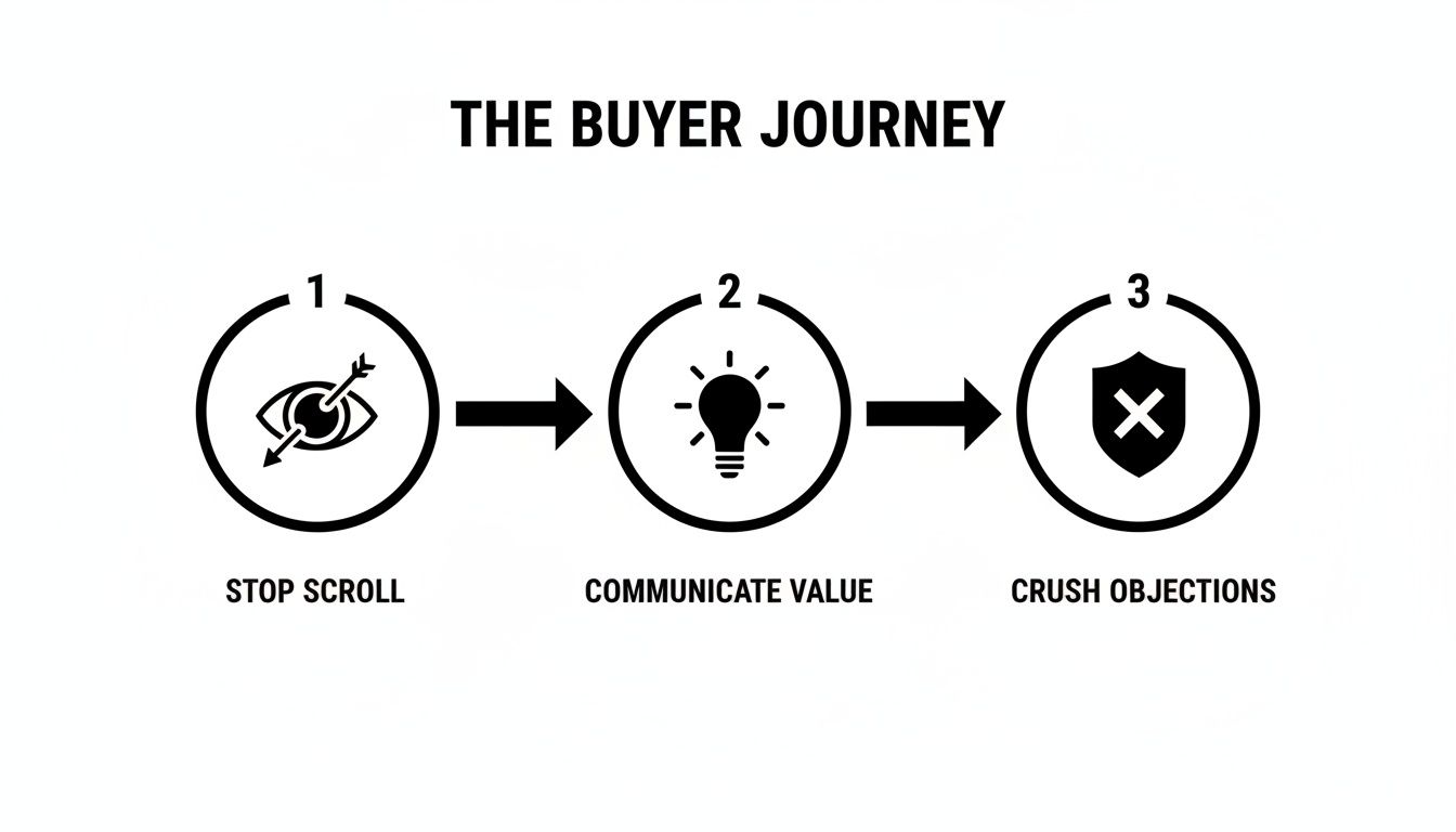
Stop the scroll, communicate value, and crush objections. That’s the entire strategy behind your image block.
The Hero Image: Your Click-Winner
Your main image has exactly one job: win the click in the search results. Nothing else matters.
It must be a crisp, high-resolution shot of your product on a pure white background. Stick to Amazon's Terms of Service here like your business depends on it, because any misstep can get your listing suppressed.
Common mistakes are deadly. A pixelated file, showing props that aren't included, or plastering badges all over it—these are surefire ways to get flagged and instantly lose shopper trust. The hero has to be clean, professional, and tell people exactly what they're looking at.
Secondary Images: The Conversion Engine
Once you've earned that click, the real work begins. The rest of your images must close the deal, and each one needs a clear purpose. This isn't the place to dump five more shots of your product from slightly different angles.
This is where you build your case. Your six secondary images are where you make the leap from a 3% conversion rate to 4% and beyond, blending lifestyle shots, in-action photos, and sharp infographics that make your product feel like the only logical choice.
Your secondary images are your silent salesperson. They must anticipate every question, doubt, and objection a shopper has. If a customer has to scroll down to the Q&A to find an answer, you've already lost the sale.
Here's a breakdown of the specific job each image in your stack should be doing.
The Strategic Role of Each Listing Image
| Image Slot | Primary Goal | Key Elements | Common Mistake to Avoid |
|---|---|---|---|
| Image 2 | Create Lifestyle Context | Show the product in its intended environment. Help the shopper visualize it in their life. | Using generic stock photos that feel fake or disconnected from the product. |
| Image 3 | Infographic - Key Benefit #1 | Highlight the single most important feature and its direct benefit. Use minimal text and strong visuals. | Cramming too much text or multiple features into one image. One idea, one image. |
| Image 4 | Infographic - Objection Crusher | Visually address a major pain point or a common question from your customer research. | Assuming buyers know the answer. If it's a doubt, address it head-on. |
| Image 5 | Showcase a Key Differentiator | A detailed shot or diagram explaining what makes your product special (e.g., materials, technology). | Simply showing another angle of the product without adding new information. |
| Image 6 | Comparison Chart | Position your product against a competitor or a generic alternative. Clearly show why yours is better. | Being dishonest or exaggerating claims, which destroys trust. |
| Image 7 | Build Trust & Brand Story | Use social proof, a warranty, a founder's story, or premium packaging shot to seal the deal. | Ending on a weak or generic image. Finish strong. |
This structured approach turns your images from passive photos into an active selling machine. It's a repeatable framework that gives you an edge in almost any category. For more ideas on executing this, our Amazon product photography blog has plenty of deep dives.
The Research-First Framework For Image Creation
High-converting Amazon images aren't born from a designer's gut feeling. They're engineered. The entire process of building a lethal image stack starts long before you open Photoshop or book a photographer. It begins with a disciplined, research-first framework.
This is the part most sellers skip. They’ll pull up their top three competitors, tell their designer to "make it look like that, but better," and call it a day. That’s a direct path to blending in. A research-driven approach guarantees every visual element—every callout, icon, and lifestyle shot—is a direct answer to a real customer's motivation or fear.
This is how you create images that don't just look pretty. You create images that sell.
Reverse-Engineer Your Competitors' Visual Strategy
First, you need to do a deep-dive analysis of your competition. Your goal is to reverse-engineer their entire visual sales pitch to find the holes you can drive a truck through. You're not just looking at what they’re showing; you're looking for what they are deliberately not showing.
Go through the top 5-10 listings for your primary keyword. For each competitor, document everything:
- Their Visual Narrative: What story are they telling across their seven image slots? Are they leading with a flashy feature, a lifestyle benefit, or handling an objection right out of the gate?
- The Objections They Address: Look at their infographics. Are they tackling durability? Size? Ease of use? Make a note of which pain points they are actively trying to solve.
- The Benefits They Emphasize: What’s the main value they’re pushing visually? Is it convenience, luxury, performance, or something else entirely?
- Glaring Omissions: What common questions or complaints from their own reviews are they completely ignoring? This is where you find your opening.
This analysis creates a clear map of the battlefield. You'll understand the established visual language in your niche, but more importantly, you'll spot the strategic gaps your competition has left wide open.
Mine Customer Reviews for Raw Intelligence
Your best creative brief is already written for you. It's scattered across hundreds of customer reviews—on your listings and your competitors'. This is the unfiltered voice of your customer, and it's an absolute goldmine for image ideas.
The process is simple but incredibly powerful. Systematically read through the 1-star, 2-star, 4-star, and 5-star reviews, looking for recurring patterns.
- 5-Star Reviews Reveal Purchase Drivers: When customers are happy, they tell you exactly why. Look for phrases like "I was so happy it came with..." or "The best part is how it..." These are your core benefits, handed to you on a silver platter.
- 1-Star Reviews Expose Sales Blockers: Angry customers are even more direct. They point out every unmet expectation and every reason they regret their purchase. Things like "I thought it would be bigger" or "It broke the first time I used it" are literal instructions for your objection-crushing infographics.
Your goal is to pull out the top 3-5 purchase drivers and the top 3-5 sales blockers. This raw intel becomes the foundation for your image plan, ensuring your visuals speak directly to real-world customer feedback.
This deep dive into what customers are actually saying is priceless. It's how you close the conversion gap. Organically ranked Amazon listings often see high conversion rates because shoppers have built-in trust. Strategic visuals, built on this kind of research, are the great equalizer that lifts performance across all your traffic sources.
Translate Search Intent into Visuals
Finally, look at your search query data. The exact words customers type into the search bar reveal their core problem. Someone searching for a "durable waterproof backpack for hiking" has a very different need than someone looking for a "lightweight laptop backpack for college."
Pay attention to the modifiers people use: words like "easy," "small," "heavy-duty," or "for beginners." Every single one is a clue. If "easy to assemble" is a common phrase in your search reports, then one of your images absolutely must show how simple and fast assembly is. For apparel, new tech like AI model creation offers a scalable way to show off products on different body types, directly matching search intent for style and fit.
By weaving together competitor analysis, review mining, and search data, you build a bulletproof creative brief. This research-first approach takes all the guesswork out of the equation. It ensures your images aren't just decorative but are precision tools for amazon listing optimization for conversions. You can see how this research gets put into practice with services that build conversion-focused Amazon images based on these exact principles.
Applying Visual Hierarchy for Mobile Shoppers

Here's a hard truth: designing your images on a 27-inch monitor while over half your customers are squinting at a 6-inch screen is a recipe for failure.
A desktop-first mindset is dead. Mobile isn't just another channel; it's the primary battleground where your sale is won or lost in the time it takes to swipe. On that tiny screen, there is no room for clutter, confusion, or guesswork.
Your weapon in this fight is visual hierarchy. It’s the art of arranging visual elements to pull the shopper’s eye exactly where you want it to go. For mobile, that means instant clarity.
Command Attention with Size and Contrast
The most basic rule of visual hierarchy: bigger things feel more important. In a mobile infographic, the single largest piece of text should scream the main benefit. It must be instantly readable without the dreaded pinch-and-zoom.
Contrast is your next best friend. Use a bold, on-brand color for a key icon or callout against a neutral backdrop to make it pop. Too many sellers use a dozen different colors, creating a visual circus. Stick to a limited, high-contrast palette to force attention where it matters.
Your shopper's thumb is hovering, ready to swipe away. Your image has less than two seconds to communicate its core message. If a key benefit is buried in a 10-point font, it might as well not exist.
Design for the Vertical Scan
Mobile users don't read; they scan. Vertically. Your infographics must be built for this behavior.
A text-heavy, horizontal layout that looks passable on a desktop becomes a jumbled, unreadable disaster on a phone. The best mobile images are designed in a portrait orientation, with information stacked logically from top to bottom.
Here's a proven formula:
- Lead with an Icon: Start with a simple, universally understood icon that represents the benefit.
- Follow with a Bold Headline: State the core benefit in a big, clean font. Keep it to 3-5 words, max.
- Add a Sub-Headline: Briefly explain how or why in a smaller font. Be ruthless with word count.
This top-down structure lets a shopper absorb the entire message in a single glance. It's a deliberate design that respects their time and delivers the goods with brutal efficiency.
Avoiding Common Mobile Design Blunders
Many listings are sabotaged by easily avoidable mobile design flaws. These mistakes create friction, make the shopper think too hard, and give them every reason to click away. The whole point of your amazon listing optimization for conversions is to eliminate those friction points.
One of the worst offenders is the "wall of text" infographic. Cramming five features and a paragraph of copy into one image is a guaranteed way to get ignored. On a phone, it becomes a blurry mess. Each infographic gets one job—to communicate one core idea. That's it.
Another killer is a cluttered composition. Stop adding decorative swooshes, unnecessary graphics, or competing elements that distract from the message. Simplicity is clarity. Every single pixel must have a purpose. If it doesn't support the main point, delete it. Your job is to make the decision to buy as easy as humanly possible.
Connecting Visuals to Your Business Metrics and KPIs
Investing in strategic images isn’t a creative expense; it’s a hard-nosed business decision with a measurable return. Too many sellers treat their visuals like an art project, completely missing the straight line between a well-designed infographic and a lower Advertising Cost of Sale (ACoS).
Your images are a force multiplier. They directly impact the key performance indicators that dictate your profitability and ability to scale. When you get your visuals right, you're not just making your listing look better—you're systematically improving your core business metrics.
It all starts with two big ones: Click-Through Rate (CTR) and Unit Session Percentage.

Driving Primary Conversion Metrics
Your hero image has one job: drive your Click-Through Rate (CTR). On a crowded search results page, a clean, compelling main image that screams "this is what you're looking for" will always earn more clicks than a blurry or confusing one. A higher CTR is your first signal to Amazon that your product is relevant.
Once a shopper lands on your page, your secondary images take over to drive your Unit Session Percentage—Amazon's term for conversion rate. A strategic image stack that answers questions, crushes objections, and builds desire will turn more lookers into buyers. This is the entire point of amazon listing optimization for conversions.
And the potential is huge. While average conversion rates vary by category, the best listings push well past 15%. With third-party sellers making up the majority of units sold on the platform, a killer visual strategy is your key to grabbing a bigger piece of the pie. You can find more data on Amazon conversion rate benchmarks on parahgroup.com.
Unlocking Second-Order Effects on Rank and PPC
The impact doesn't stop with direct conversions. These primary metrics create a powerful ripple effect that fuels your entire Amazon flywheel.
A higher Unit Session Percentage is one of the strongest signals you can send to Amazon's A9 ranking algorithm. When your listing converts traffic better than your competitors, Amazon sees your product as a more profitable result to show customers.
This kicks off a virtuous cycle:
- Better images boost your conversion rate.
- A higher conversion rate improves your organic keyword rank.
- Higher organic rank brings in more high-intent traffic.
- That traffic converts, cementing your rank even further.
This same logic makes your ad dollars work harder. A listing that converts well will naturally have a lower ACoS. You can afford to bid more aggressively or just enjoy better margins because every click you pay for is more likely to become a sale. Strong images make your PPC campaigns efficient by default.
Validating Image Impact with A/B Testing
You don’t have to guess if your new images are working. Amazon’s ‘Manage Your Experiments’ tool lets you scientifically prove the impact of your visual changes, turning creative debates into cold, hard data.
Stop arguing over which image "looks better" in a team meeting. The only opinion that matters is your customer's, and the only way to hear it is through data. For serious sellers, A/B testing is non-negotiable.
Use this tool to test one variable at a time. Always start with your hero image, as it has the biggest potential impact on CTR. Run a test comparing your old hero against a new one for at least two weeks to get statistically significant results.
Once you have a winning hero, move on to your secondary images. You can test an entirely new image stack against your old one to measure the lift in Unit Session Percentage. The data will tell you, with confidence, whether your investment paid off. This reframes image optimization from a cost center into one of the highest-ROI activities you can undertake.
Your Listing Is A Visual Sales Pitch
Let's get one thing straight: your Amazon listing is not a product page. It's a high-stakes, high-speed visual sales pitch. The moment you internalize this, your entire approach to optimization will change.
Stop thinking of your images as a simple gallery. Start treating them as your primary sales force—because that’s exactly what they are.
For too long, sellers have obsessed over bullet points and backend keywords, treating images like a box to be checked. This completely misunderstands how people actually shop on Amazon. Your visuals are the only thing that has a prayer of stopping a shopper's thumb. Your copy only matters after your images have done the heavy lifting.
The Levers of Conversion
The framework we've covered isn't about guesswork or making things look "nice." It’s a systematic process for engineering conversions, built on a few non-negotiable principles.
A Research-First Framework is Mandatory: High-converting images are born from data, not design trends. You must start by digging deep into competitor strategy, mining customer reviews, and analyzing search intent. Anything less is just guessing.
Every Image Must Have a Job: Think of your seven image slots as a sales funnel. The hero wins the click. The secondary images build desire, handle objections, and close the sale. Wasting a single slot on a redundant angle or a filler shot is a critical mistake.
Mobile-First Design is Non-Negotiable: If your infographics are unreadable on a phone without pinching to zoom, they've failed. Simple as that. Visual hierarchy—using size, contrast, and clean fonts—is everything. You have to deliver your message with instant clarity on a tiny screen.
This strategic approach is what transforms a listing from a passive catalog entry into an active conversion machine. It is the single most effective lever you can pull to improve not just your sales, but your PPC efficiency and organic ranking, too.
Stop treating your images like an expense on a checklist. They are your single greatest conversion asset. An investment in a strategically designed image set will deliver a higher return than almost any other activity you can undertake for your brand on Amazon.
So the final question is a direct challenge: Are you selling, or are you just listing? Your competitors who get this distinction are the ones winning your market share. They know that a powerful visual sales pitch doesn't just attract buyers; it creates them.
Building this kind of visual strategy takes a dedicated process. If you're ready to move beyond generic photos and want to explore a research-driven approach, you can learn about our methodology and get in touch with our team of Amazon image specialists. Your listing's true potential is waiting to be unlocked, and it all starts with the images.
Ready to transform your listing into a high-converting sales machine? ProductShots creates research-driven Amazon images designed to boost your sales. Get your complete, optimized image stack in just 2-3 business days. Order your listing images today!